
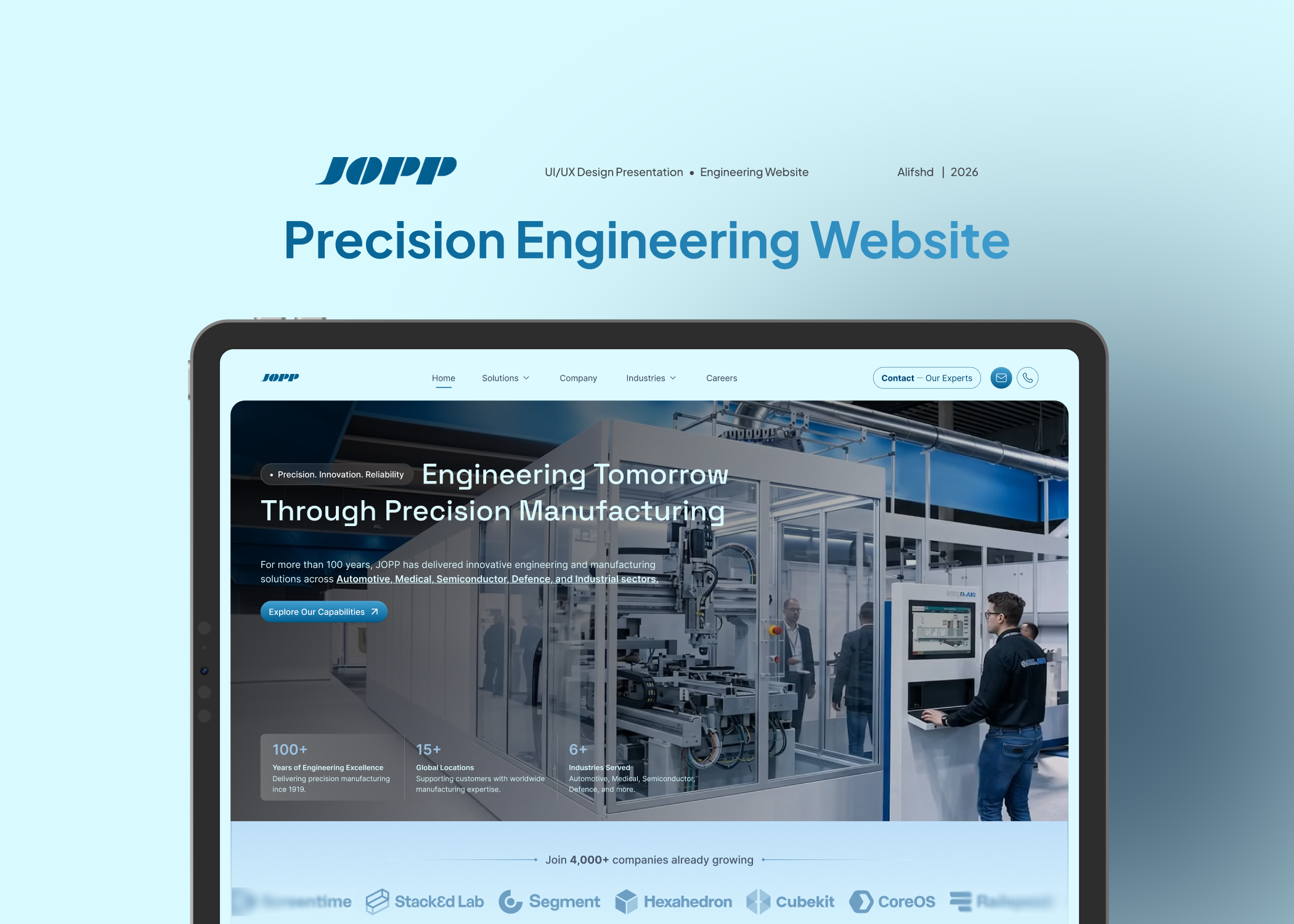
JOPP has more than one hundred years of engineering experience behind its name. The challenge was to make that experience easier to understand online and to show the people, facilities, industries and processes behind the work.
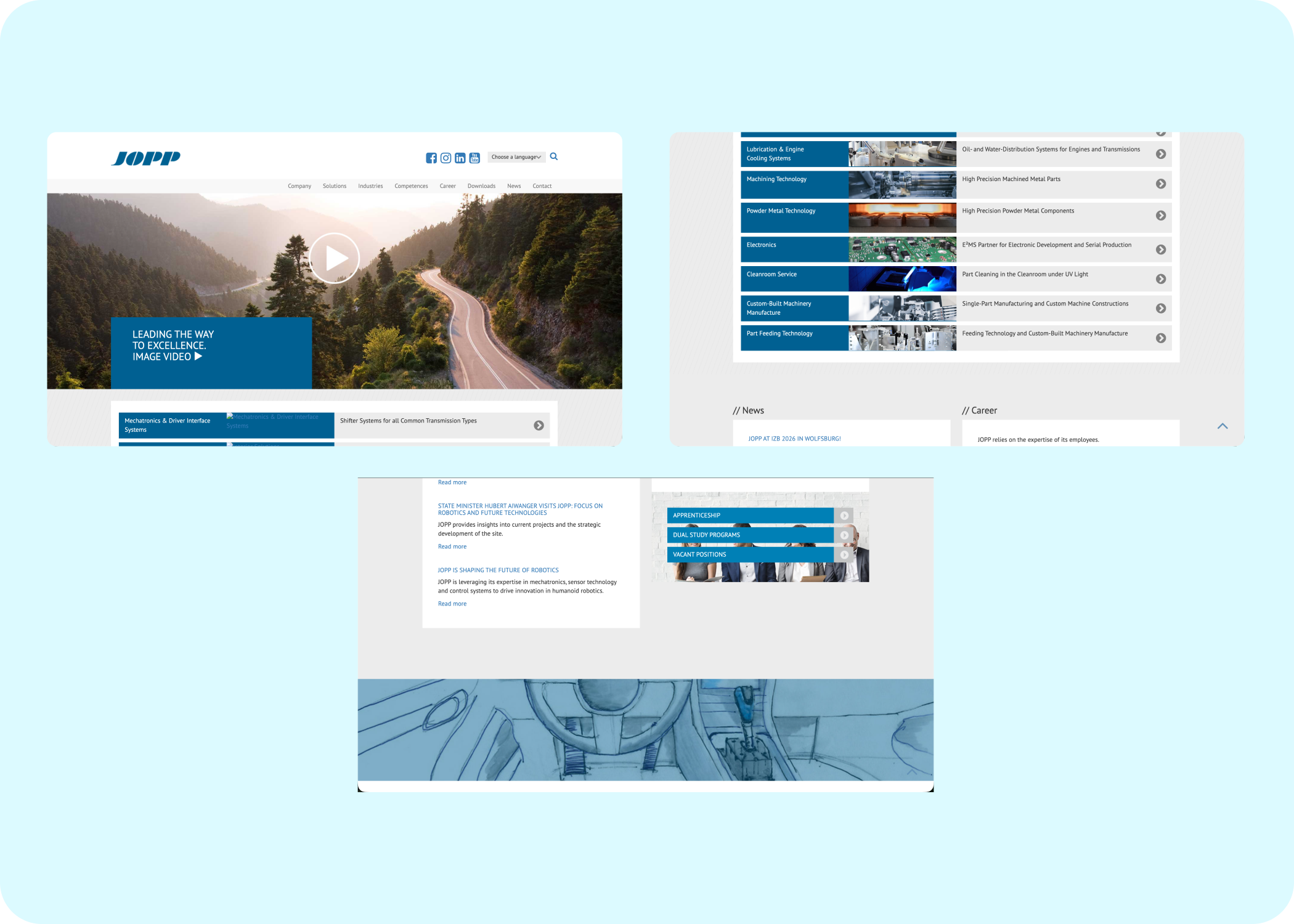
The previous experience felt functional but difficult to explore. Important information was spread across long pages and the first screen did not communicate the scale of JOPP quickly enough.
The website needed a stronger introduction, a clearer content structure and more visual proof of the work happening inside the company.
Create a modern landing page that presents JOPP as an experienced engineering partner while keeping the communication precise and easy to scan.
The experience needed to help visitors understand three things quickly.
JOPP has deep engineering experience.
JOPP works across several critical industries.
JOPP can support a project from the first idea through production.
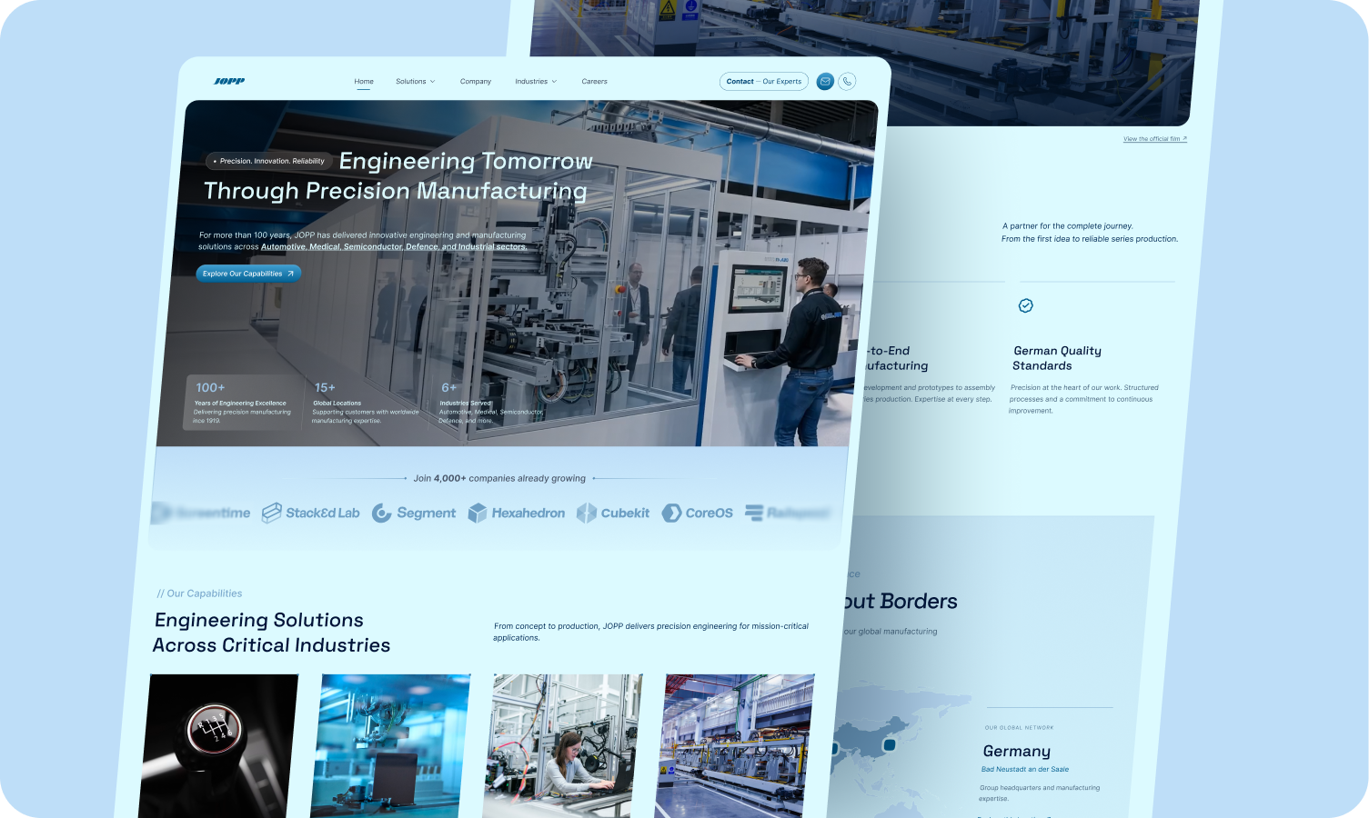
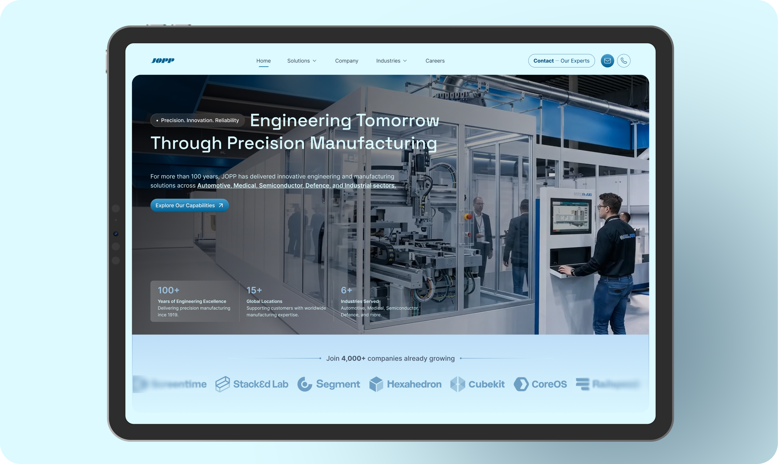
The new hero section uses a full screen manufacturing video to place the visitor inside the world of JOPP immediately. The headline is direct and memorable.
Supporting copy introduces the company in one short paragraph and links directly to the capabilities section. Key facts sit below the message so visitors can understand the scale of the business without leaving the first screen.
The capabilities section turns the main industries into visual entry points. Each card combines a focused image, a clear label and a simple hover interaction.
The dark industries section adds a second way to explore the business. Visitors can scan Automotive, Medical, Industrial, Aerospace, Defence and Semiconductor and reveal a short description when they interact with a card.
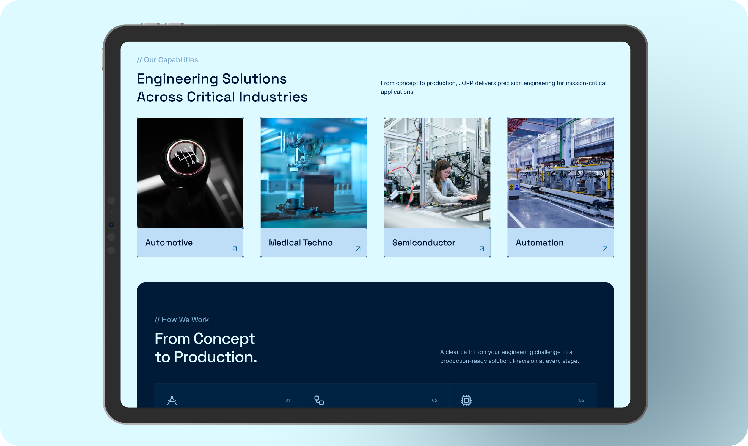
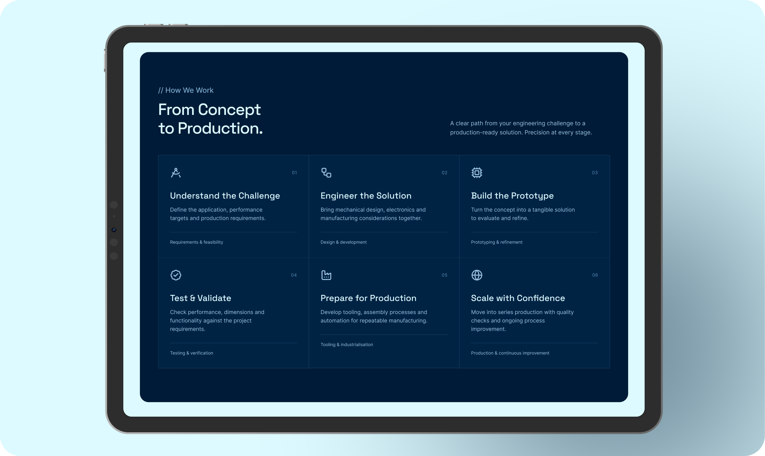
The process section explains the path from an engineering challenge to production.
Each step has its own card and line drawn icon. The motion gives the icons a hand drawn feeling as they appear, which adds character without distracting from the information.
The result is a process that feels easier to follow and easier to remember.
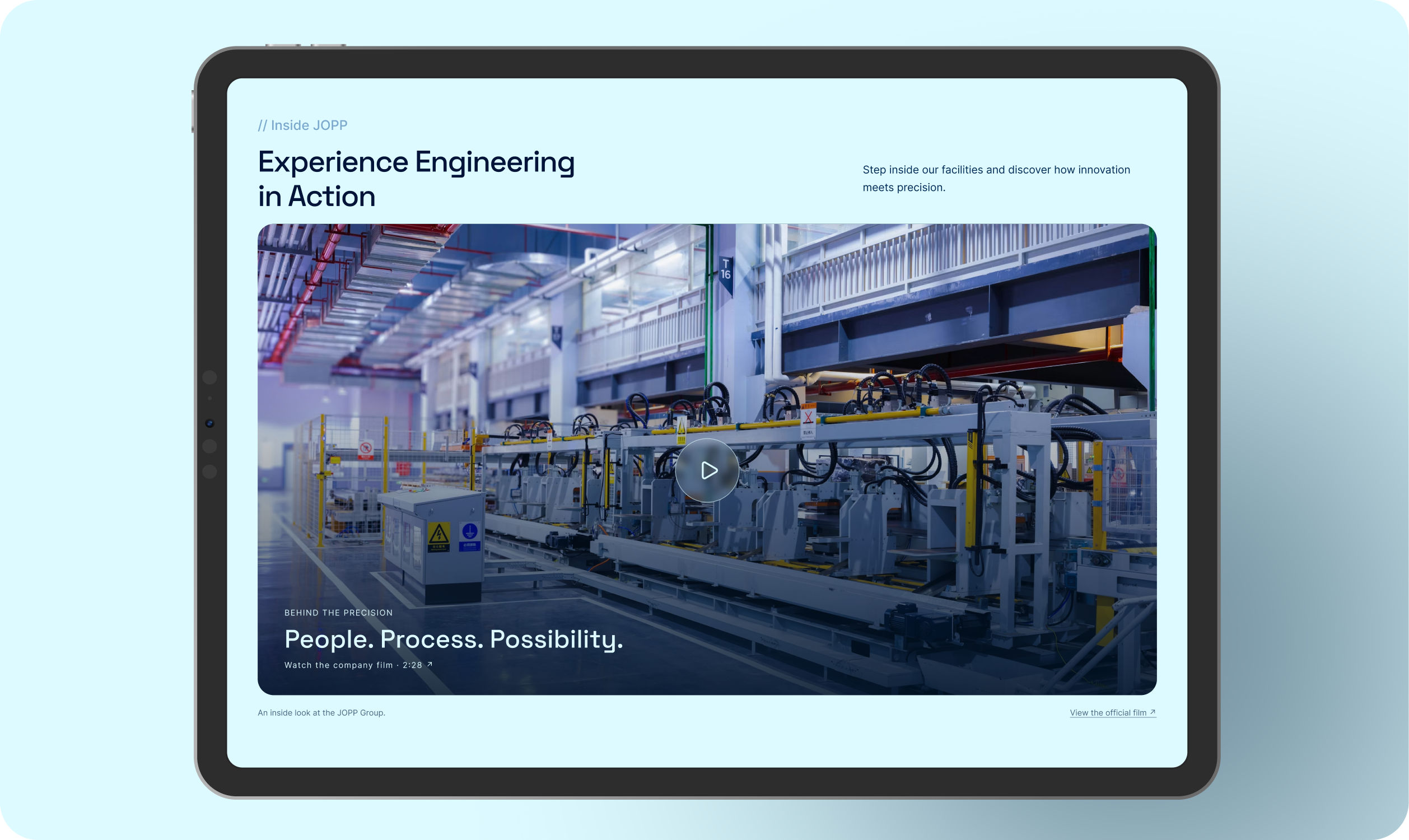
One of the most important additions is the Inside JOPP section.
Instead of relying on long paragraphs, the page uses a large facility video to show production lines, robotics, engineers, testing and the people behind the work. The video gives the company a more human and tangible presence.
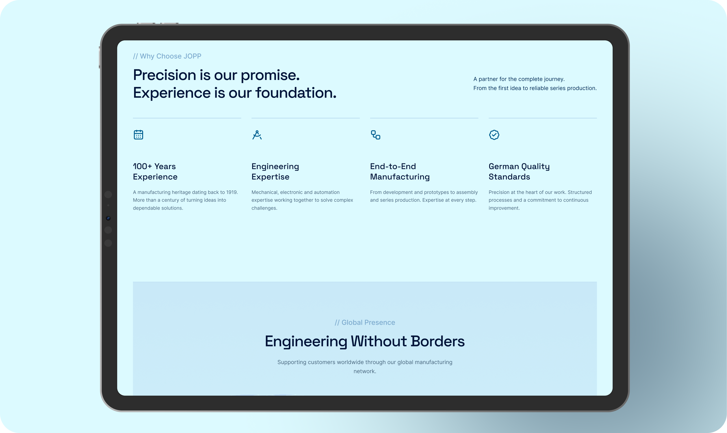
The next section answers a simple visitor question: why JOPP? Four focused cards cover the strongest reasons.
The layout leaves enough space around each point so the section feels confident and easy to scan.
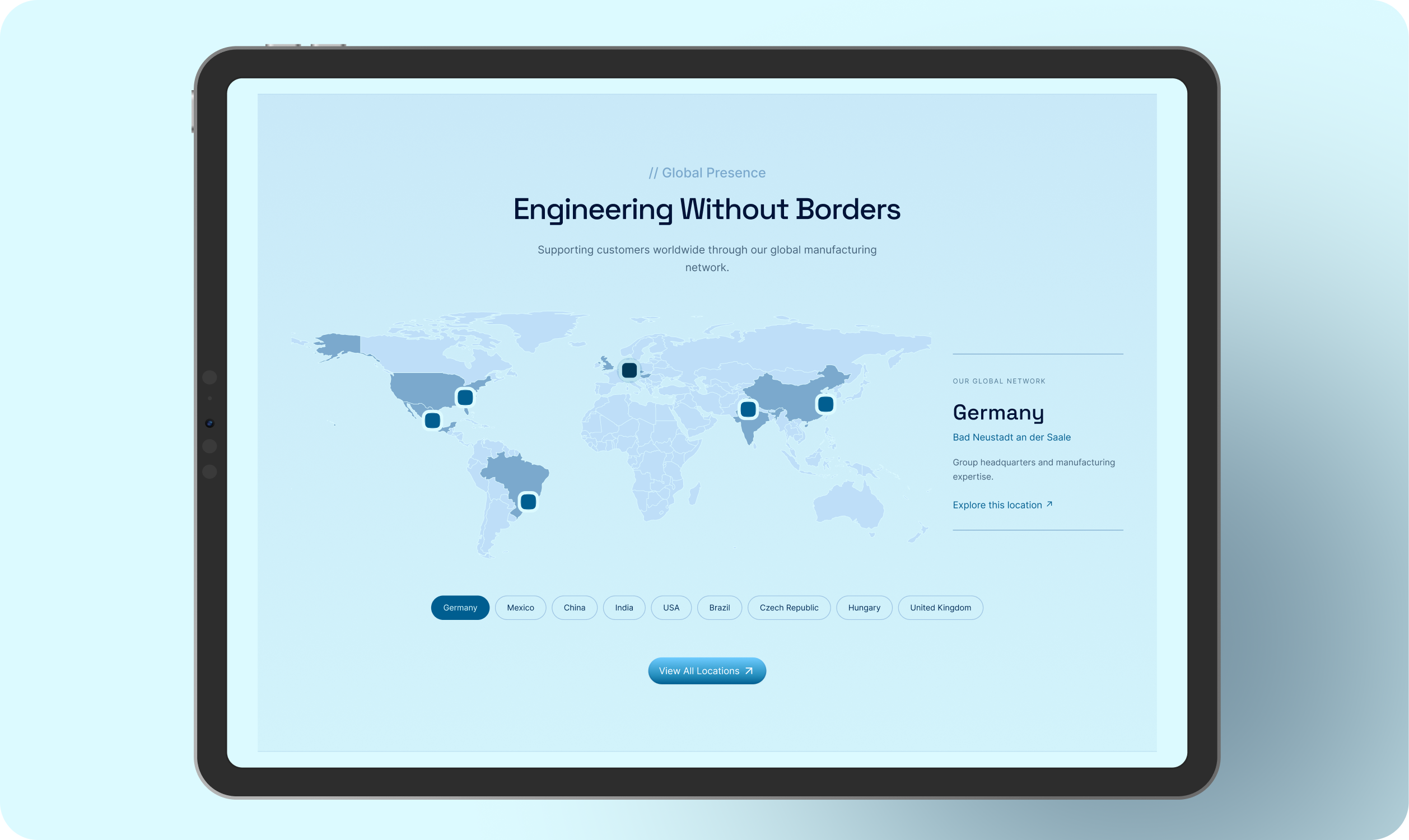
The global presence section combines a world map with location pins and an interactive location panel. Visitors can select a country and see the related city and description without losing their place on the page.
This makes the international network feel more approachable and useful.
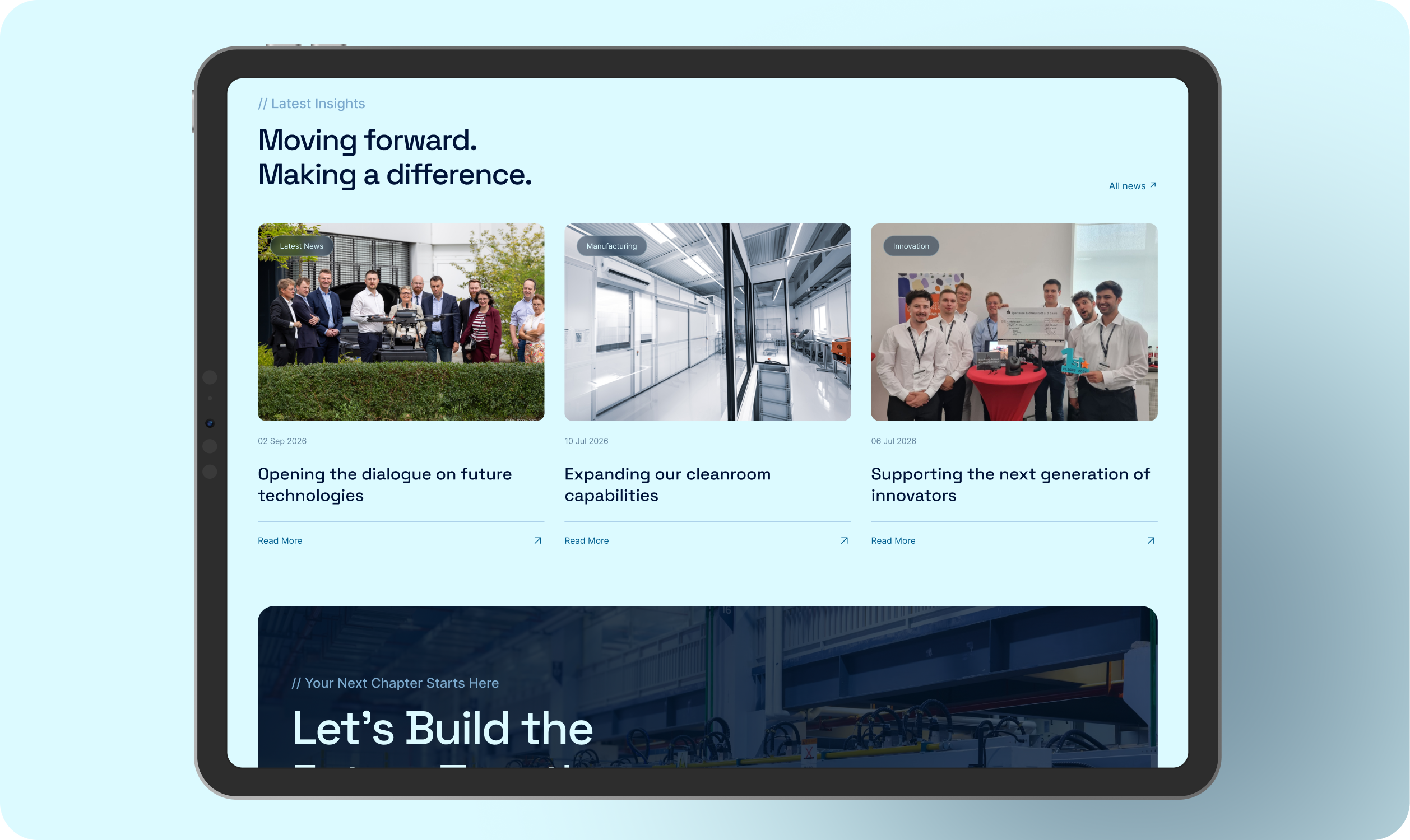
The latest insights section gives the homepage a living layer. News, manufacturing updates and innovation stories show that JOPP is active today and continuing to move forward.
Each story uses a strong image, a small category label, a date and a simple read more action.
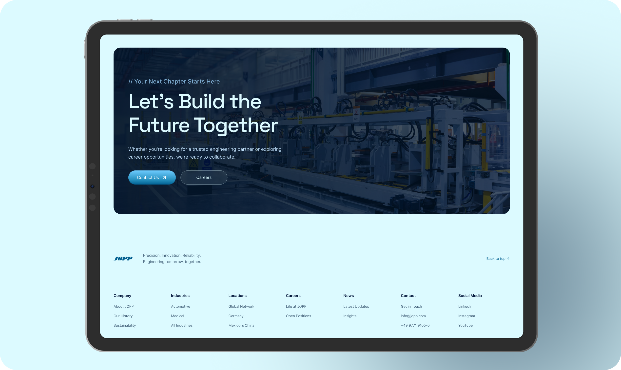
The page ends with a dark factory image and a direct invitation.
Visitors can contact JOPP or explore career opportunities from the same section. The two actions use equal sizing and a clear visual hierarchy so the next step feels easy.
The visual system is based on a pale cyan background, deep engineering navy and bright JOPP blue accents. Rounded containers, soft glass effects and subtle borders give the page a modern technical character.
Typography stays simple with Inter for body copy and Space Grotesk for large headlines. Motion is used to guide attention through the page with reveal transitions, smooth hover states, moving partner logos and a sticky navigation bar with a blurred background.
The new landing page gives JOPP a clearer digital story.
Visitors can understand the company faster, explore industries more naturally and see the real work behind the brand. The experience balances the credibility of an established manufacturer with the clarity and energy expected from a modern engineering company.
I created an AI assisted prototype to turn my own design into a working website experience. The prototype helped me test the layout, motion and interaction details before implementation.
It also became a clear visual reference for developers. They could see how the design should behave in practice, including section reveal animations, smooth scrolling, sticky navigation, hover states, moving partner logos, video interactions and responsive transitions.
The goal was to make the design easier to understand beyond static screens. Every important interaction could be reviewed in context so the final implementation stayed close to the original design intention and matched the expected experience across the page.
Implemented Design Link : Click Here


