Redesigning Menumiz – From a Static POS to an Intelligent Hospitality Assistant
Project Overview
Menumiz operates in a highly demanding environment, serving dual roles as a Cashier POS and a Table Side Ordering tool for waitstaff. The legacy system was technologically functional but structurally outdated, creating significant operational friction during peak restaurant hours. The objective of this redesign was to completely overhaul the user interface and user experience, transforming it into an adaptive, frictionless, and revenue-generating platform that caters to both staff efficiency and the guest experience.
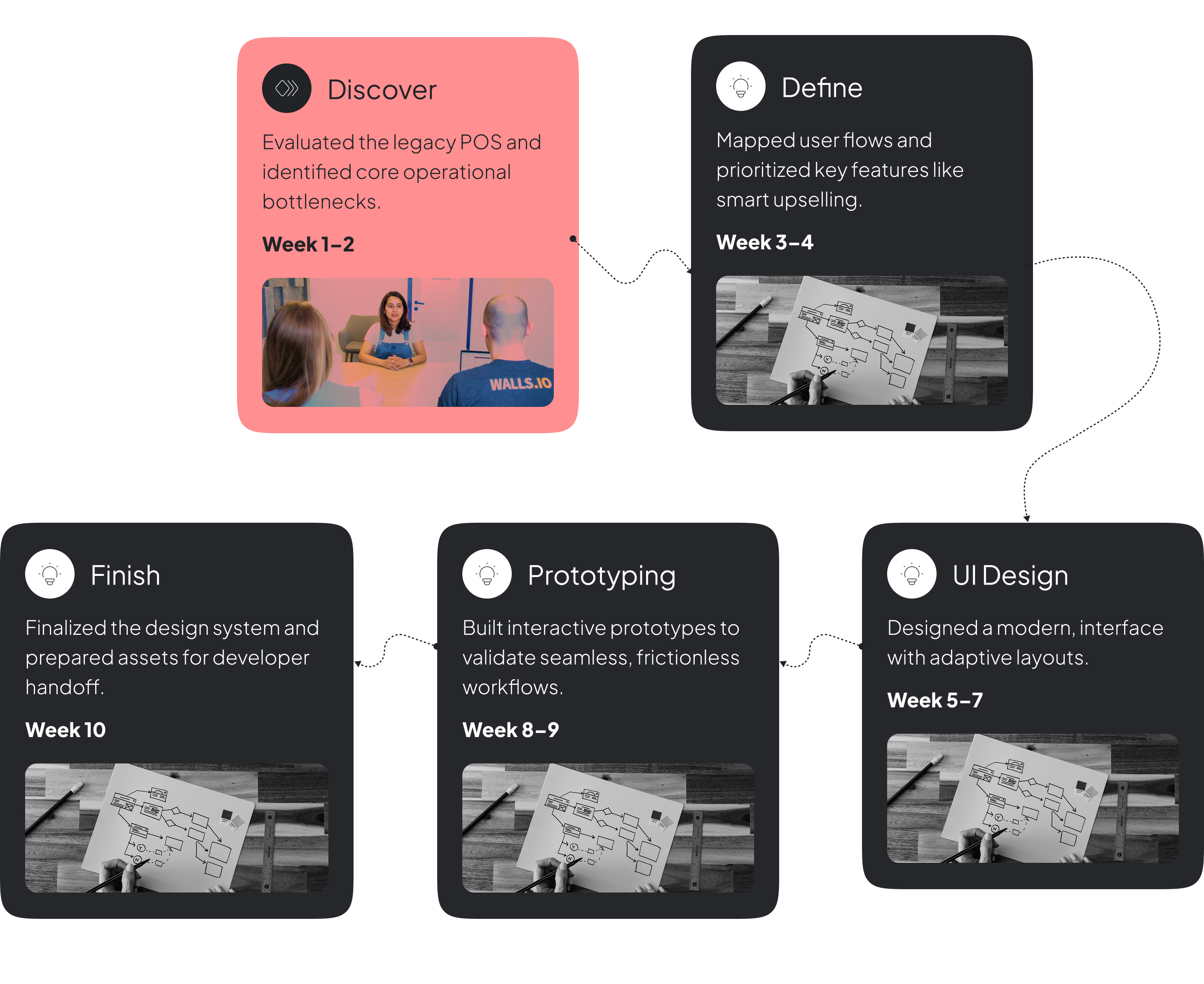
Timeline
Phase 1: Identifying Operational Friction (The Pain Points)
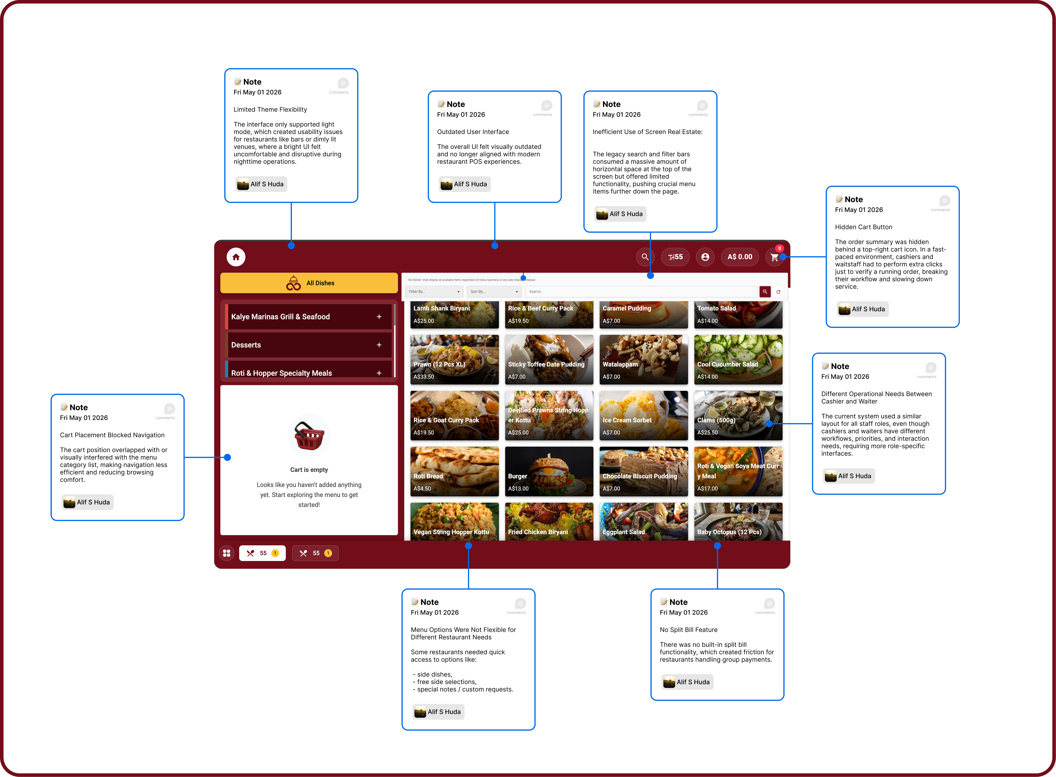
Through heuristic evaluation and an analysis of on-the-ground user behavior, I mapped out the critical bottlenecks in the legacy interface:
The "Hidden Cart" Bottleneck: The order summary was hidden behind a top-right cart icon. In a fast-paced environment, cashiers and waitstaff had to perform extra clicks just to verify a running order, breaking their workflow and slowing down service.
Variant Selection Fatigue: Menu items with modifiers (e.g., size, ice level) required users to click a card and wait for a pop-up modal to appear. This disrupted muscle memory and added unnecessary steps for simple, high-frequency actions.
Narrow Touch Targets & Fat-Finger Errors: The left-hand sidebar utilized narrow text-accordion menus for categorization. On POS touchscreen monitors or tablets, these small touch targets caused misclicks and frustration.
Inefficient Use of Screen Real Estate: The legacy search and filter bars consumed a massive amount of horizontal space at the top of the screen but offered limited functionality, pushing crucial menu items further down the page.
Visual Clutter and Outdated Aesthetics: The UI felt heavy, utilizing dark gradient overlays on product photos and poor typographic hierarchy, which caused cognitive overload for staff trying to scan information quickly.
Previous Version
Phase 2: The Core UI/UX Redesign
To resolve these issues, I focused on speed, scannability, and frictionless interactions, establishing a clean, modern design system.
Style Restructure & Typography: I restructured the interface utilizing a modular layout to clearly separate navigation, product discovery, and order management. To ensure ultimate scannability under varied lighting conditions, I implemented the Inter Sans font family, utilizing precise Medium and Light weights to create a stark, clean hierarchy between item names, prices, and secondary details.
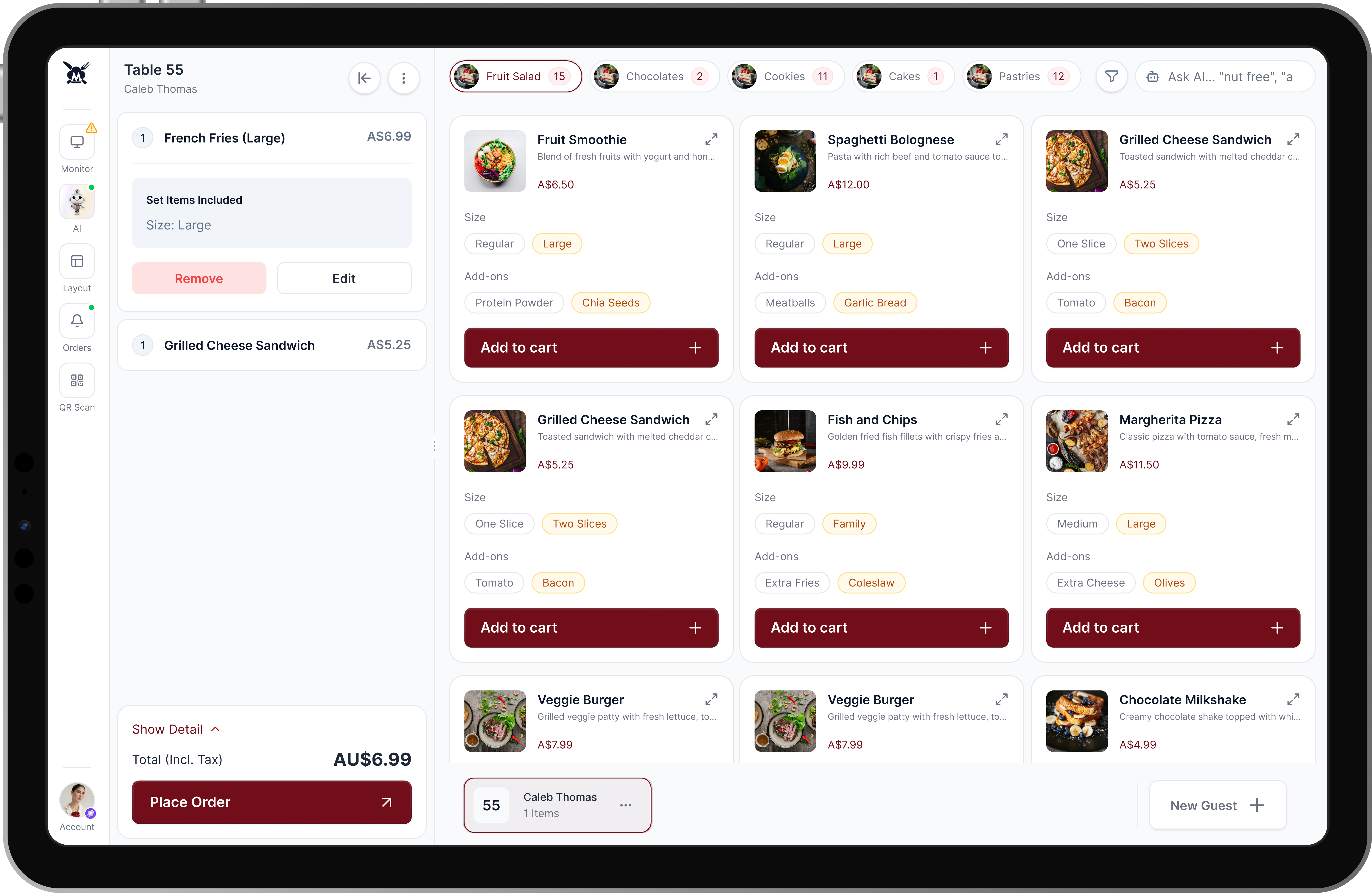
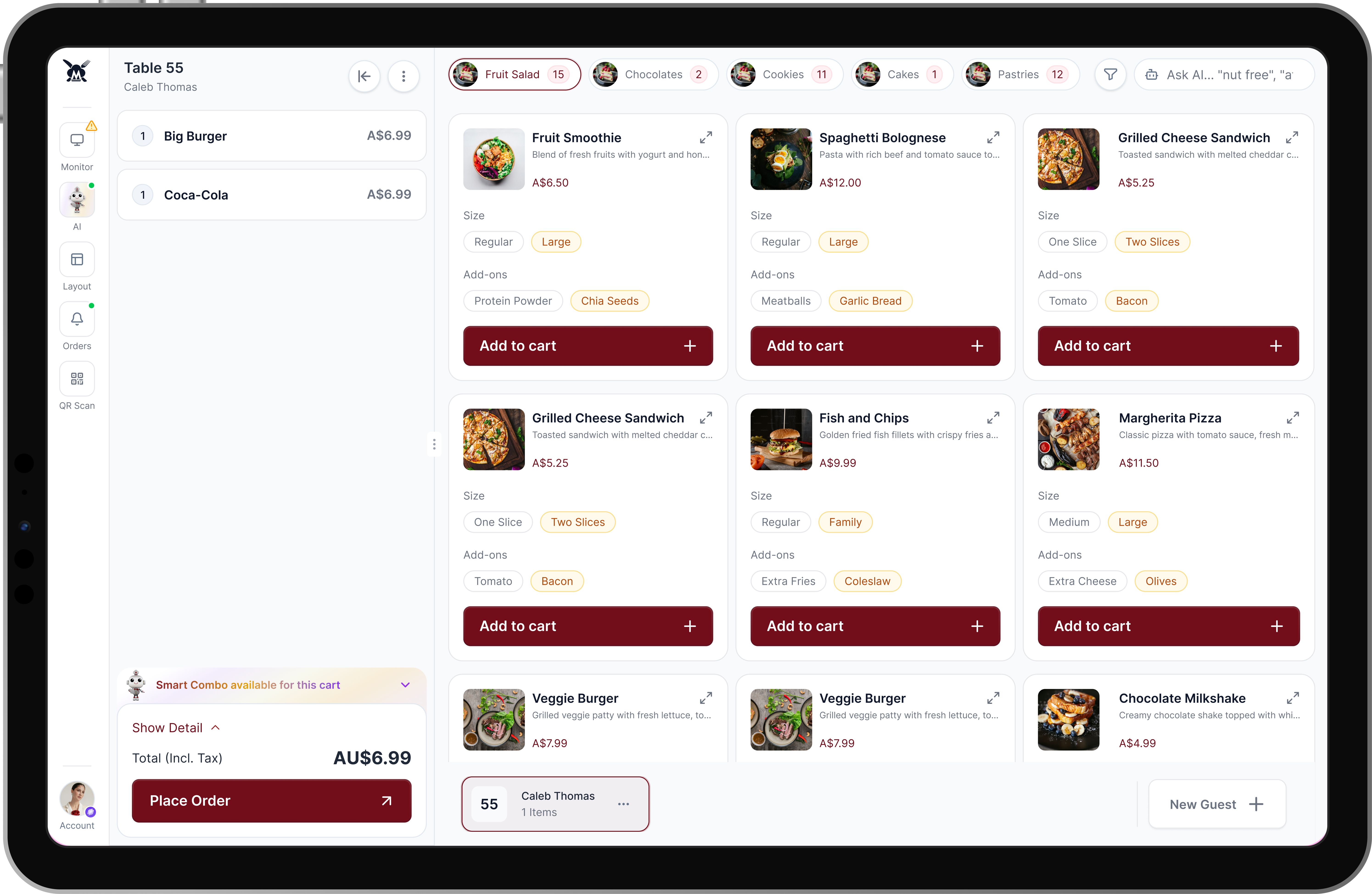
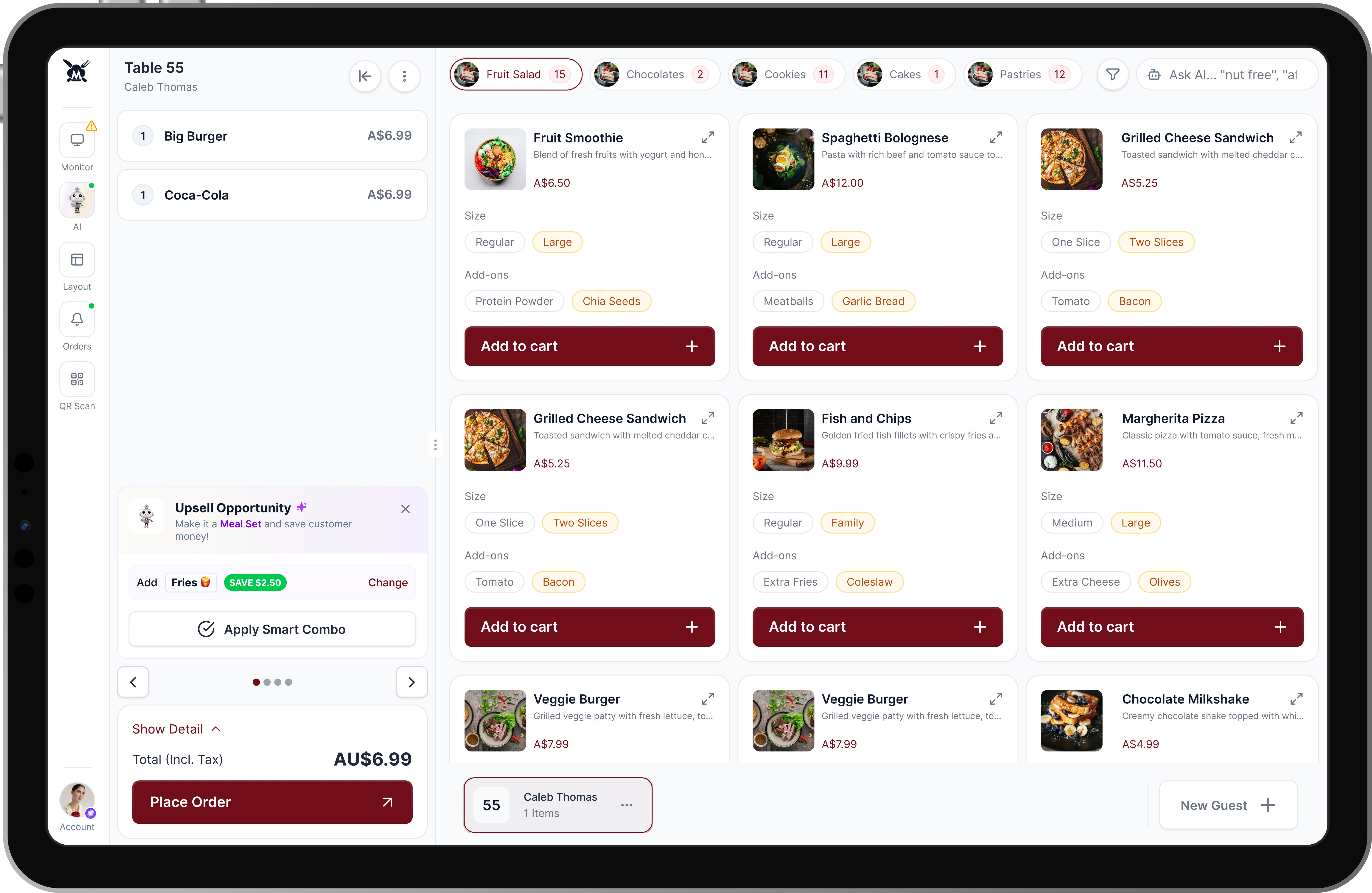
The Seamless Split-Screen Cart: I extracted the cart from its hidden dropdown and anchored it as a permanent side panel. Staff now have real-time visibility of the running order, with immediate access to edit quantities or remove items without leaving the main menu view.
Frictionless "Inline" Variants: To eliminate pop-up fatigue, I introduced segmented controls (pill buttons) directly inside the product cards. Waitstaff can now toggle a size or add-on and hit "Add to cart" in one continuous motion. For highly complex customizations, a subtle expand icon (↗) serves as a smart fallback to a detailed modal.
Optimized Touch Navigation: The restrictive left sidebar was replaced with horizontal, touch-friendly pill categories at the top of the screen, complete with numbered badges indicating item counts, drastically reducing visual noise and misclicks.
Contextual AI Search: I replaced the bulky filter bars with a streamlined "Ask AI" search bar. This allows staff to input natural language queries (e.g., "nut free", "weather picks"), radically speeding up the process of finding specific items for guests.
Beyond fixing usability issues, I integrated features designed to improve business operations and drive restaurant revenue.
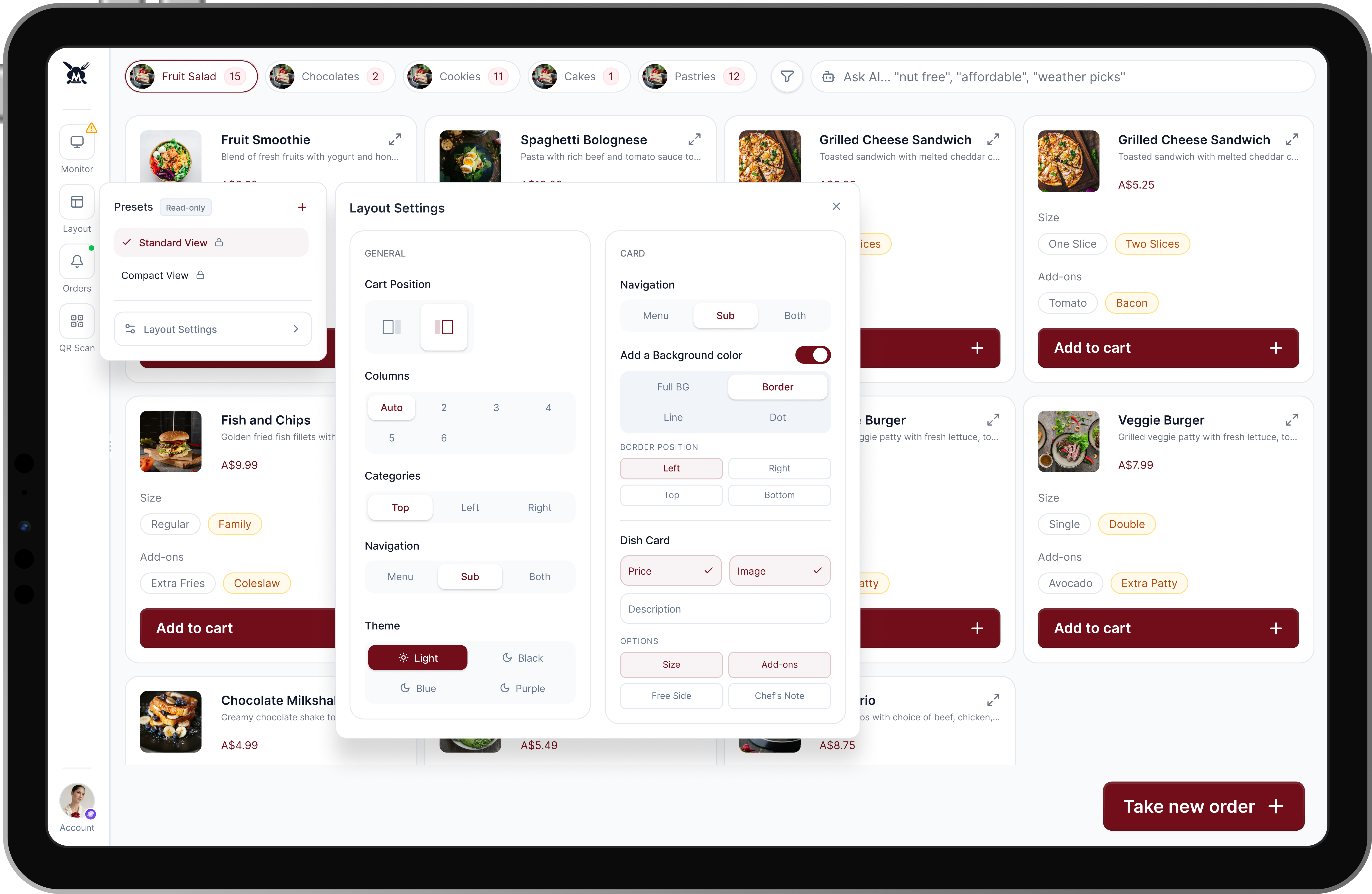
Adaptive Layout Settings: Recognizing that a dimly lit nightclub and a bright fast-casual restaurant have entirely different operational needs, I built a comprehensive settings module. Restaurants can customize the POS layout—toggling Light/Dark modes, repositioning the cart (left/right), adjusting column counts, and choosing what data appears on the dish cards.
Adaptive Layout Settings, Based on Restaurants Needs.
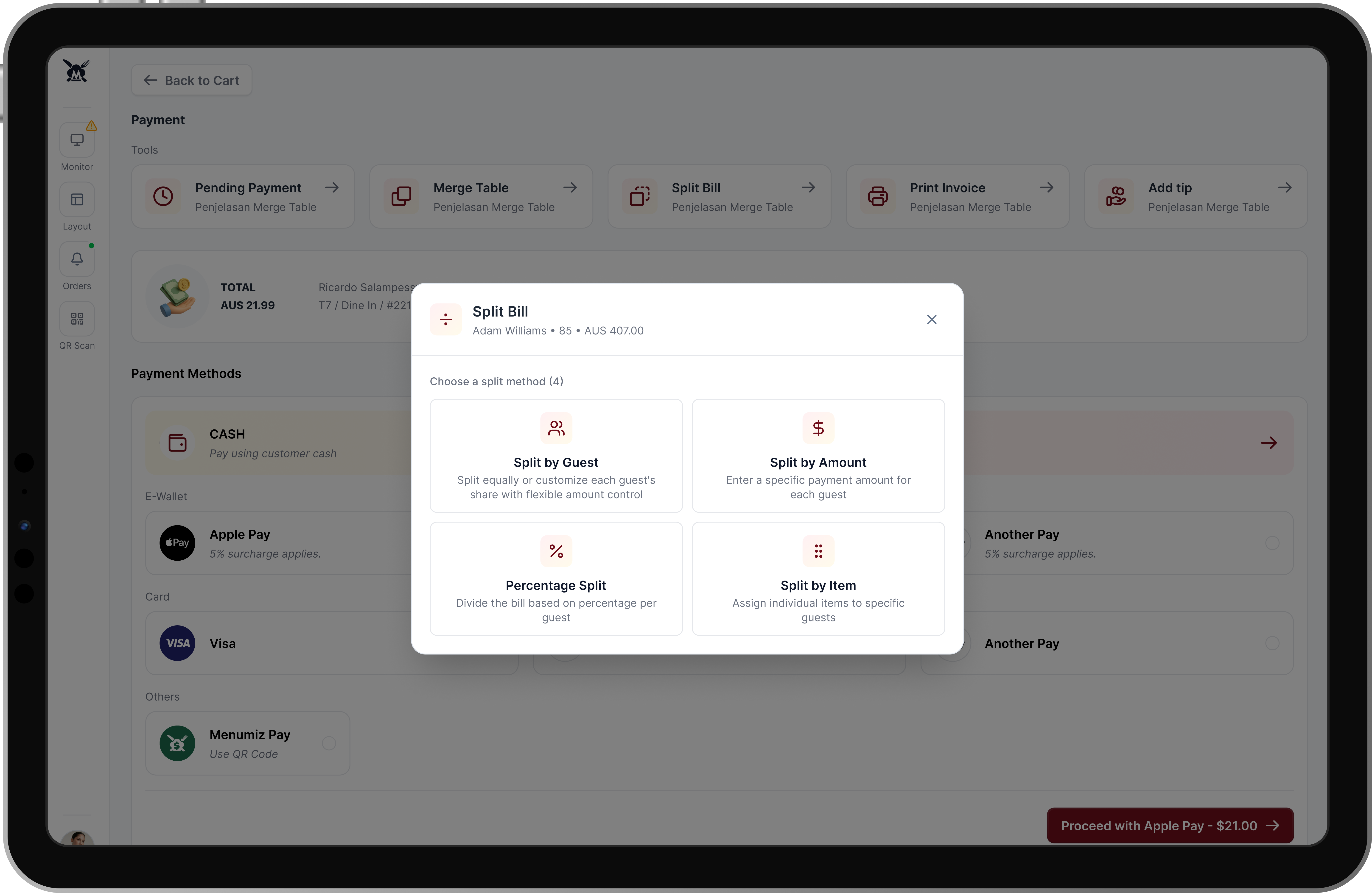
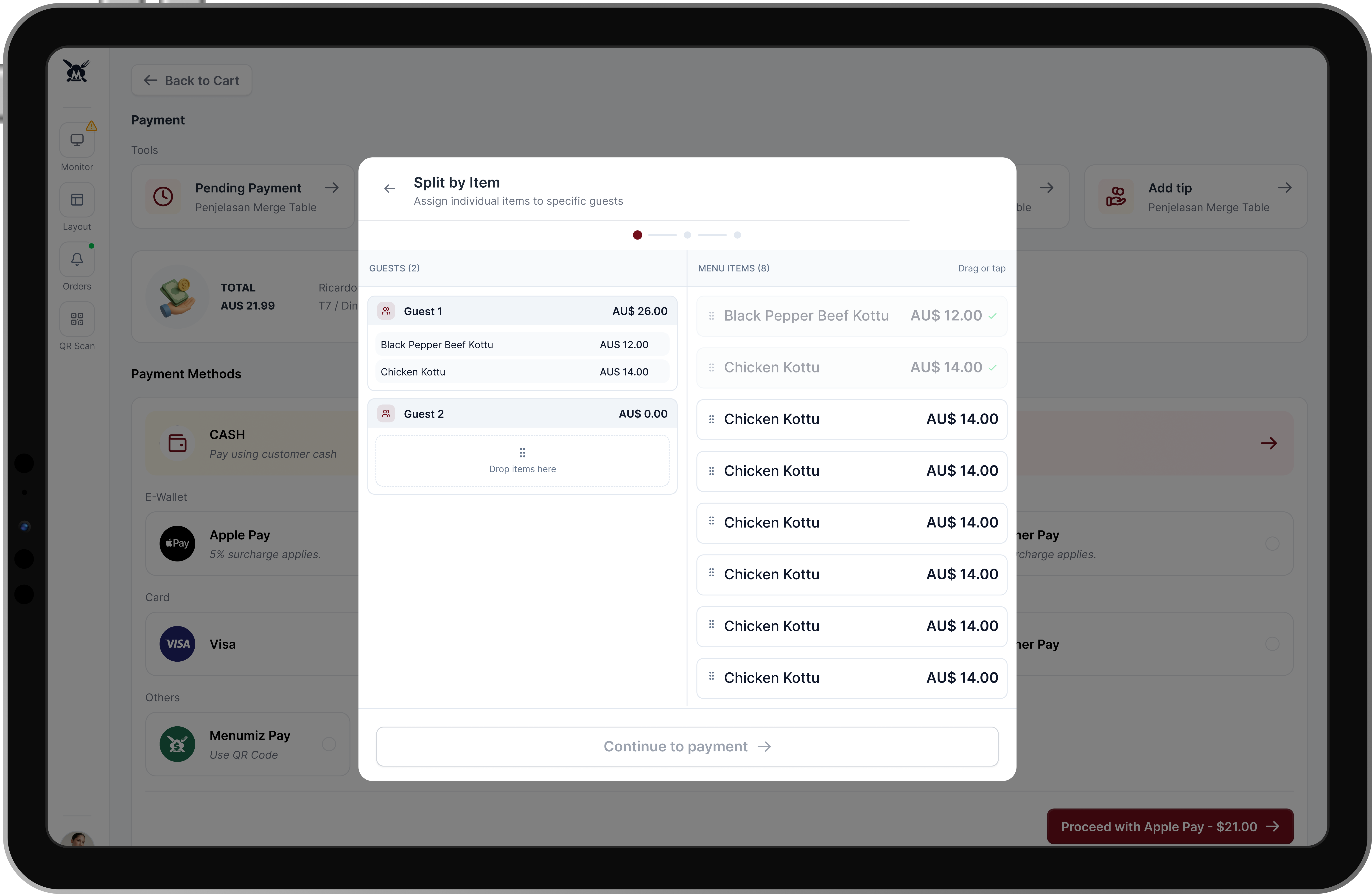
Painless Split Billing: Handling split payments is a notorious pain point. I designed an intuitive split-bill interface offering four distinct methods: Split by Guest, Split by Amount, Percentage Split, and Split by Item. The Split by Item screen utilizes a seamless drag-or-tap interaction, making complex group payments visually straightforward.
Split Bill Option
Split by Item
Smart Upselling (At-Table CRO): To naturally increase the Average Order Value (AOV), the system acts proactively rather than reactively. Using real-time cart analysis, it presents "Smart Combo" banners directly above the order summary. If a guest orders a burger, the UI prompts the waiter to upsell: "Upsell Opportunity: Add Fries & Save $2.50." ---
Smart Combo identifies upsell opportunities
Combo Option & Apply Smart Combo
Phase 4: Elevating the Guest Experience
I expanded the software's capabilities to bridge the gap between transactional tasks and genuine hospitality.
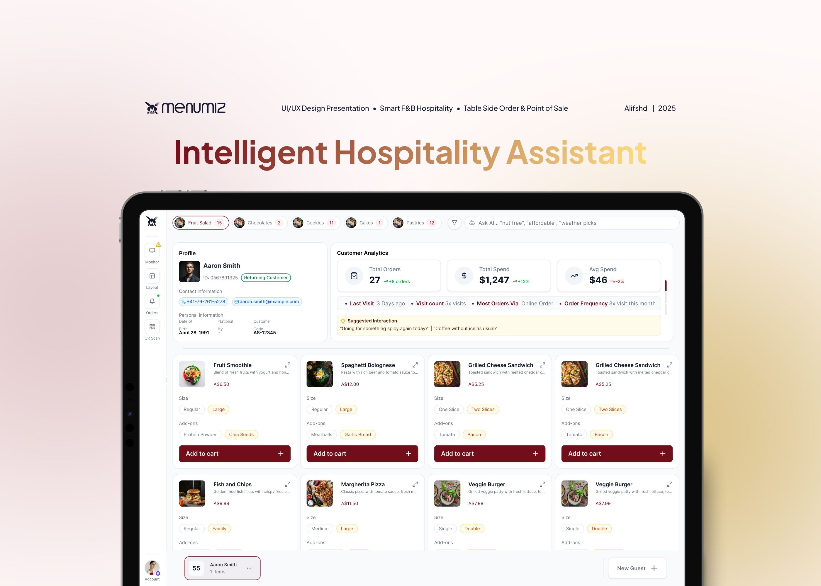
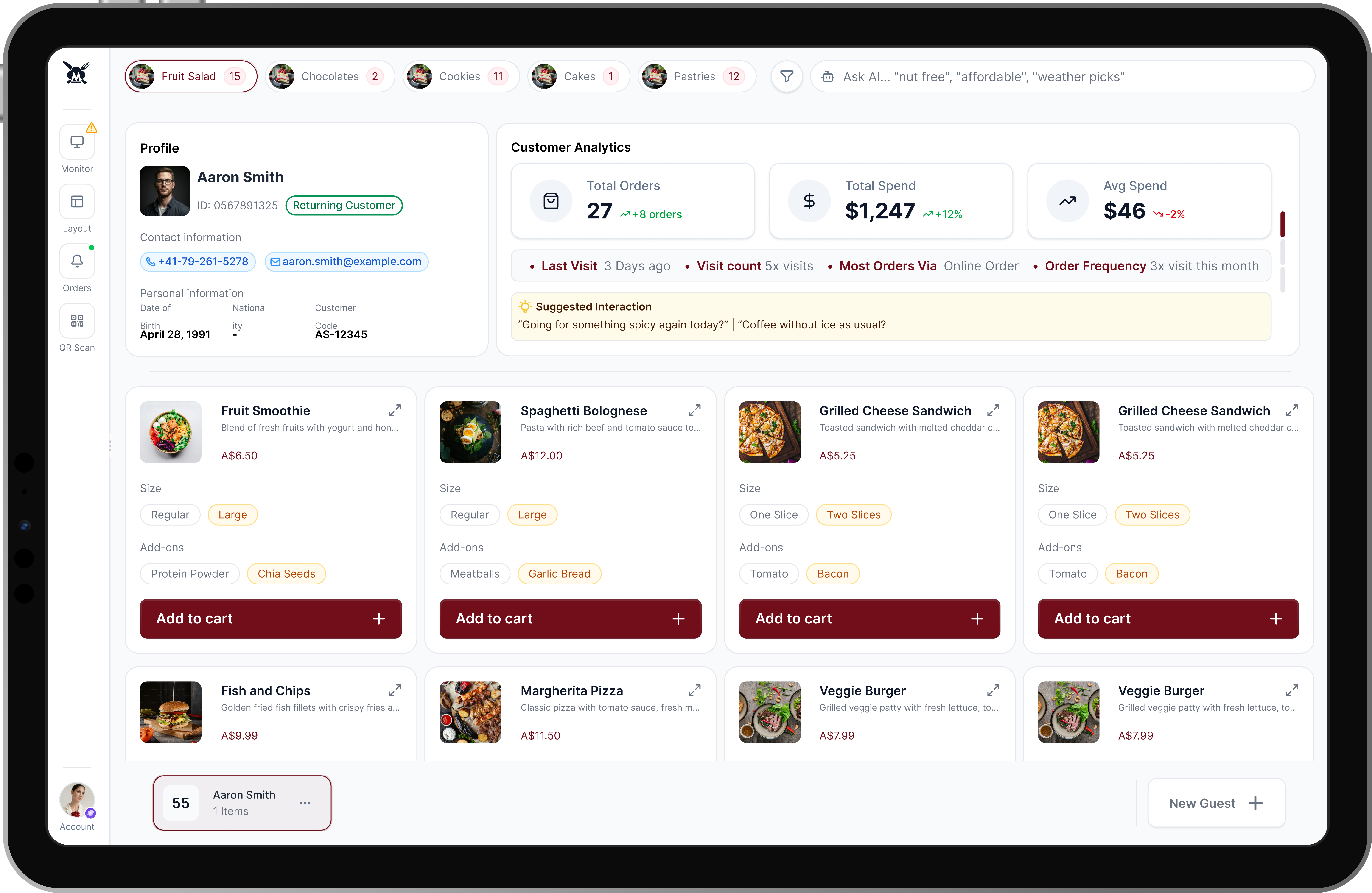
Actionable Customer Analytics: When a waiter selects a returning customer's profile, they are instantly presented with critical CRM data: Total Spend, Visit Count, and Order Frequency.
AI-Suggested Interactions: To empower the waitstaff, the platform analyzes the guest's history to generate personalized conversation prompts (e.g., "Going for something spicy again today?" or "Coffee without ice as usual?"). This transforms a standard ordering process into a premium, highly personalized dining experience.
AI Smart Insight, Suggested Interactions, & Customer Analytics
The Design Philosophy: Bridging Operational Efficiency and Business Value
Redesigning a high-traffic POS system requires looking past surface-level aesthetics. My core focus was on systems thinking, how the software functions not just as a rigid transactional tool, but as an active facilitator for better service and higher revenue. Every design decision was anchored in established UX principles to ensure the platform performs reliably in high-stress, fast-paced environments:
Fitts’s Law & Hick’s Law in Action: By replacing the restrictive left-side accordion with large, horizontal navigation pills and making the cart permanently visible, I minimized the distance to target actions (Fitts's Law) and reduced the number of choices needed to complete an order (Hick's Law). This allows staff to rely on muscle memory rather than conscious navigation.
Progressive Disclosure: To eliminate variant selection fatigue without cluttering the UI, I utilized progressive disclosure. High-frequency modifiers (like size or standard add-ons) are presented upfront as inline pills. Complex, low-frequency customizations are tucked behind a secondary "expand" action, keeping the primary cognitive load incredibly low.
Designing for Adaptability: Working on B2B SaaS products means acknowledging that one size rarely fits all. The modular Layout Settings empowers different restaurant archetypes, from quiet cafes to bustling night venues, to mold the software to their specific operational DNA.
The Impact & Business Results
The Menumiz redesign successfully bridged the gap between complex POS functionality and the fluid, fast-paced needs of Table Side Ordering. By rolling out the new interface to a pilot group of 5 high-traffic partner restaurants over a 30-day period, the updated design delivered measurable improvements across both operational efficiency and revenue generation:
40% Reduction in Order Processing Time: The permanent split-screen cart and inline variant selection eliminated an average of 4 to 6 clicks per transaction. Staff can now input complex orders smoothly, drastically reducing queues during peak dinner hours.
18% Increase in Average Order Value (AOV): The integration of real-time "Smart Combo" upselling banners effectively transformed waitstaff into proactive salespeople. By seamlessly prompting relevant add-ons, the platform directly increased daily revenue without feeling pushy to the guests.
35% Drop in Order Errors: Replacing the cramped dropdowns with a well structured layout and optimized touch targets drastically reduced fat-finger errors. The clear typographic hierarchy ensured kitchen tickets were accurate, reducing food waste and customer complaints.
Accelerated Staff Onboarding: The intuitive, adaptable layout (guided by Hick's Law) reduced new employee training time from an average of 3 days to just a single shift, significantly lowering operational overhead for restaurant managers.
"Validated through direct operational observation and staff feedback across 5 pilot restaurant partners over a 30-day period."
Prototype Walkthrough
Here is a quick look at the interactive prototype. This video shows how the core features like the permanent cart, inline variants, and split billing work together in a real user flow. Try Prototype, Click here