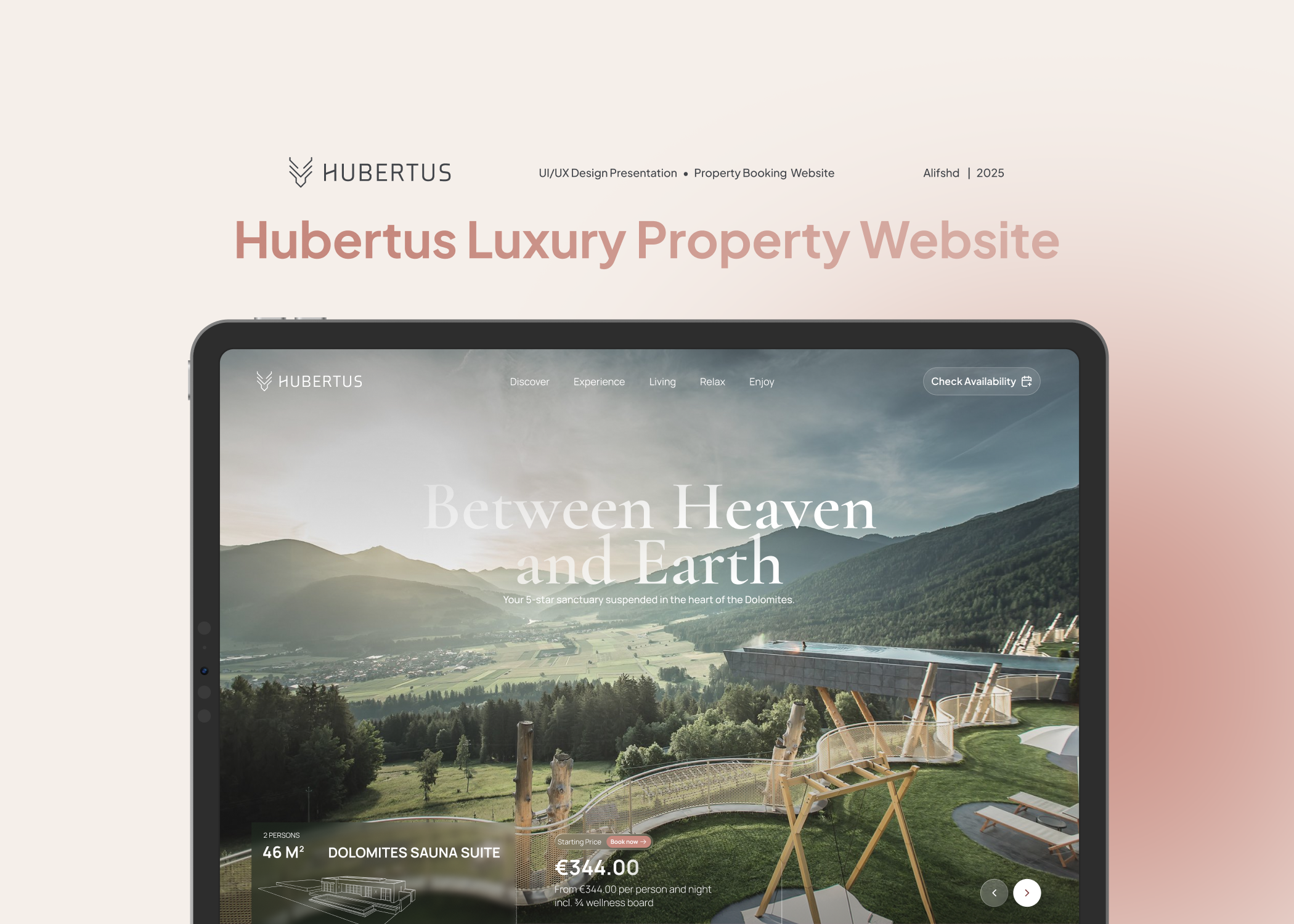
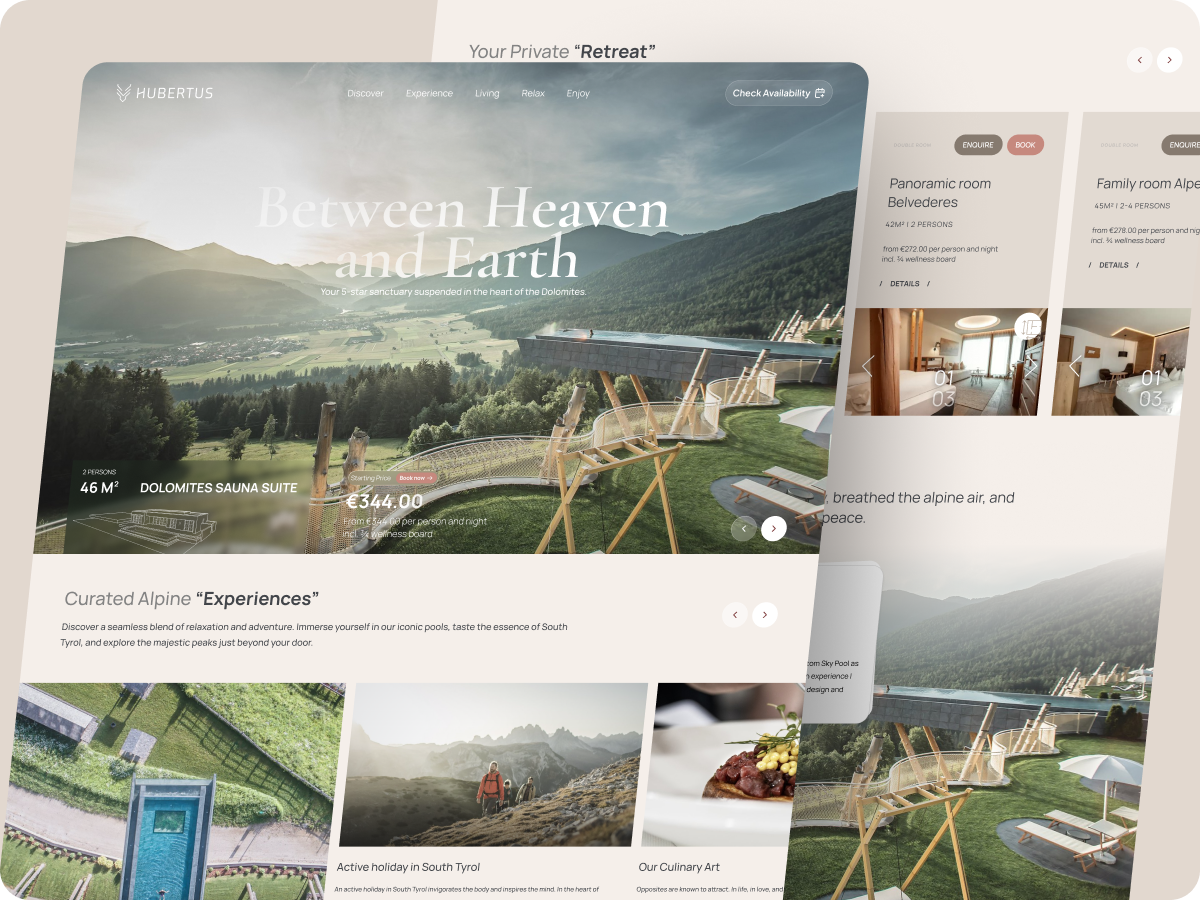
An architectural masterpiece in the Dolomites, designed to blend five-star luxury with the raw beauty of nature. The main goal of this landing is to strengthen the brand and build real trust with the people browsing the site. We want users to feel safe, comfortable, and confident in their decision to book. By mixing big, beautiful visuals with a clean interface, we’re making it easy to turn casual visitors into loyal customers without making them overthink the process.
__________________________________________________________________________________
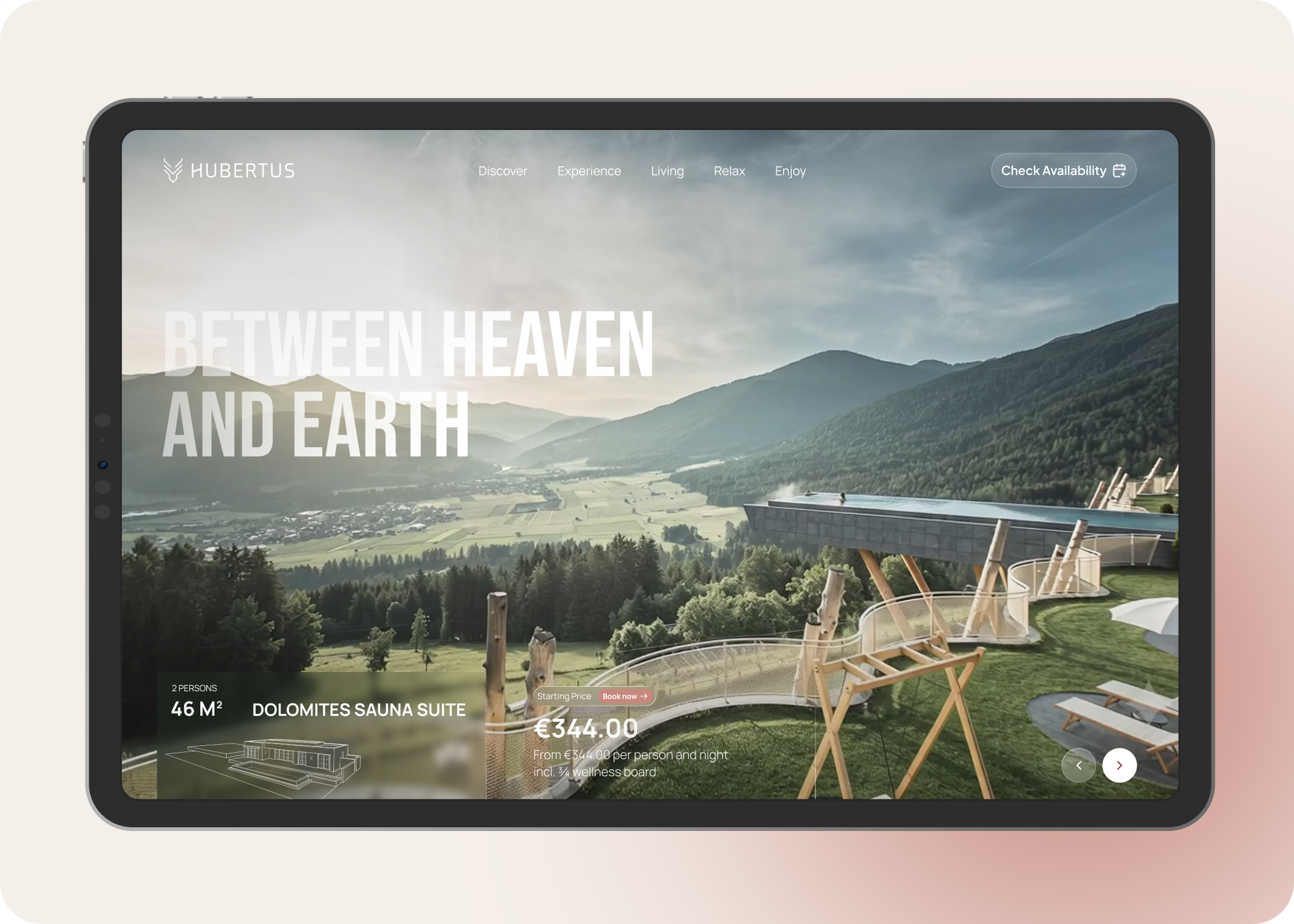
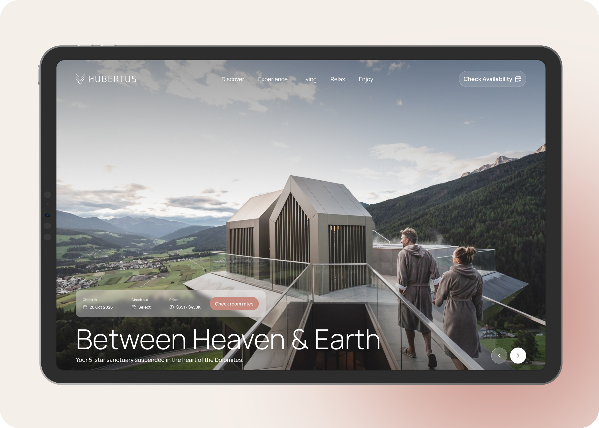
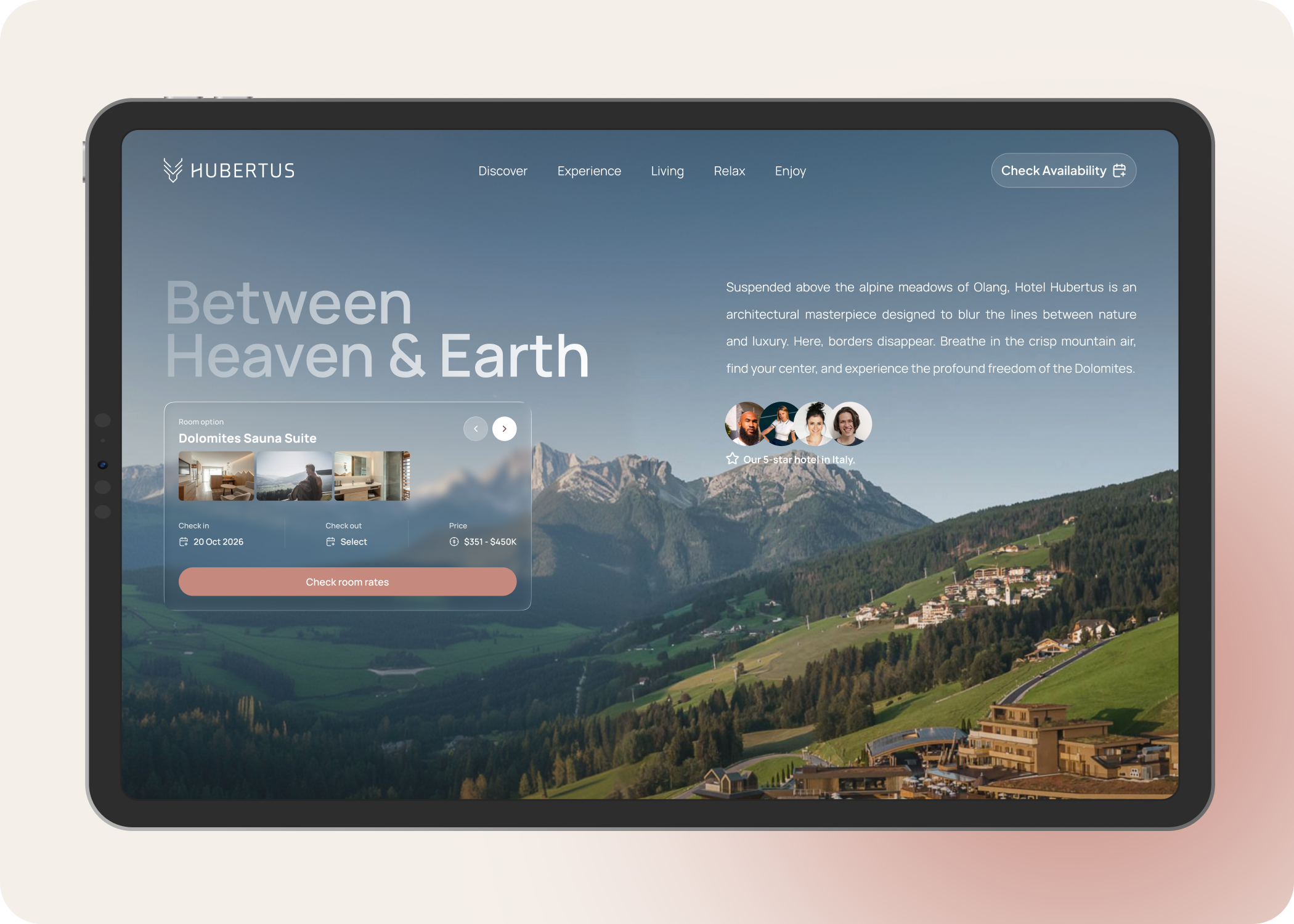
This is all about making a strong first impression. Using an AI-generated video to instantly pull people into the Dolomites vibe also i put the room options, starting prices, and the 'Book' button right up front. This way, if someone is ready to book right now, they don't have to go digging around for it.
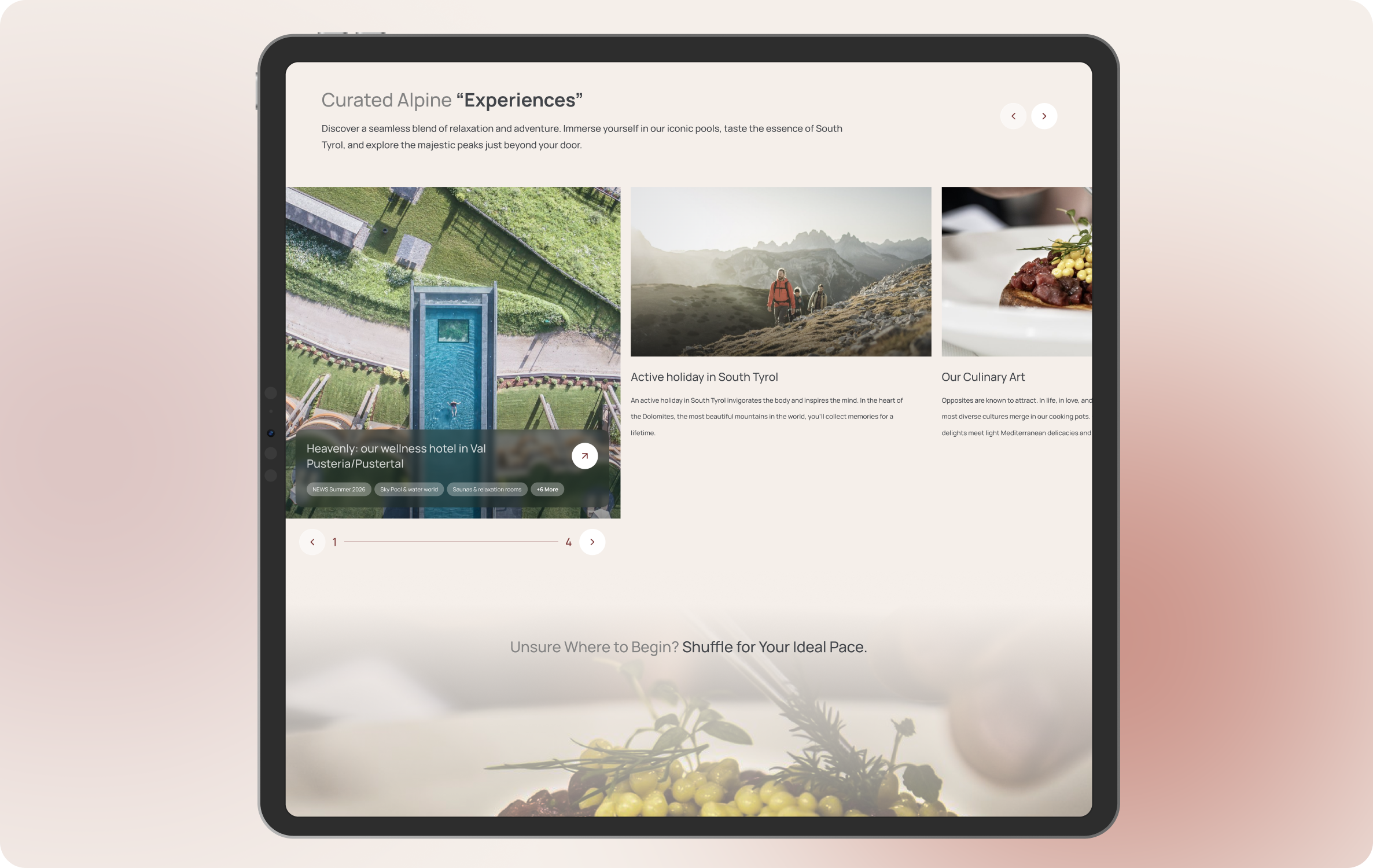
After setting the mood, I try to show them exactly what they can do here. I laid out the hotel’s best features, like the Sky Pool and the food, in a clean, modern grid. The goal is to get users imagining themselves there, turning casual browsing into actual desire before we show them the full room catalog.
Planning a trip can sometimes feel like work, so i made this part fun. The stepper breaks down a perfect day into bite-sized hours. The best part is the 'Shuffle' button it adds a little bit of gamification and shows off how many different things you can do at the hotel, letting the user find the schedule that fits them best.
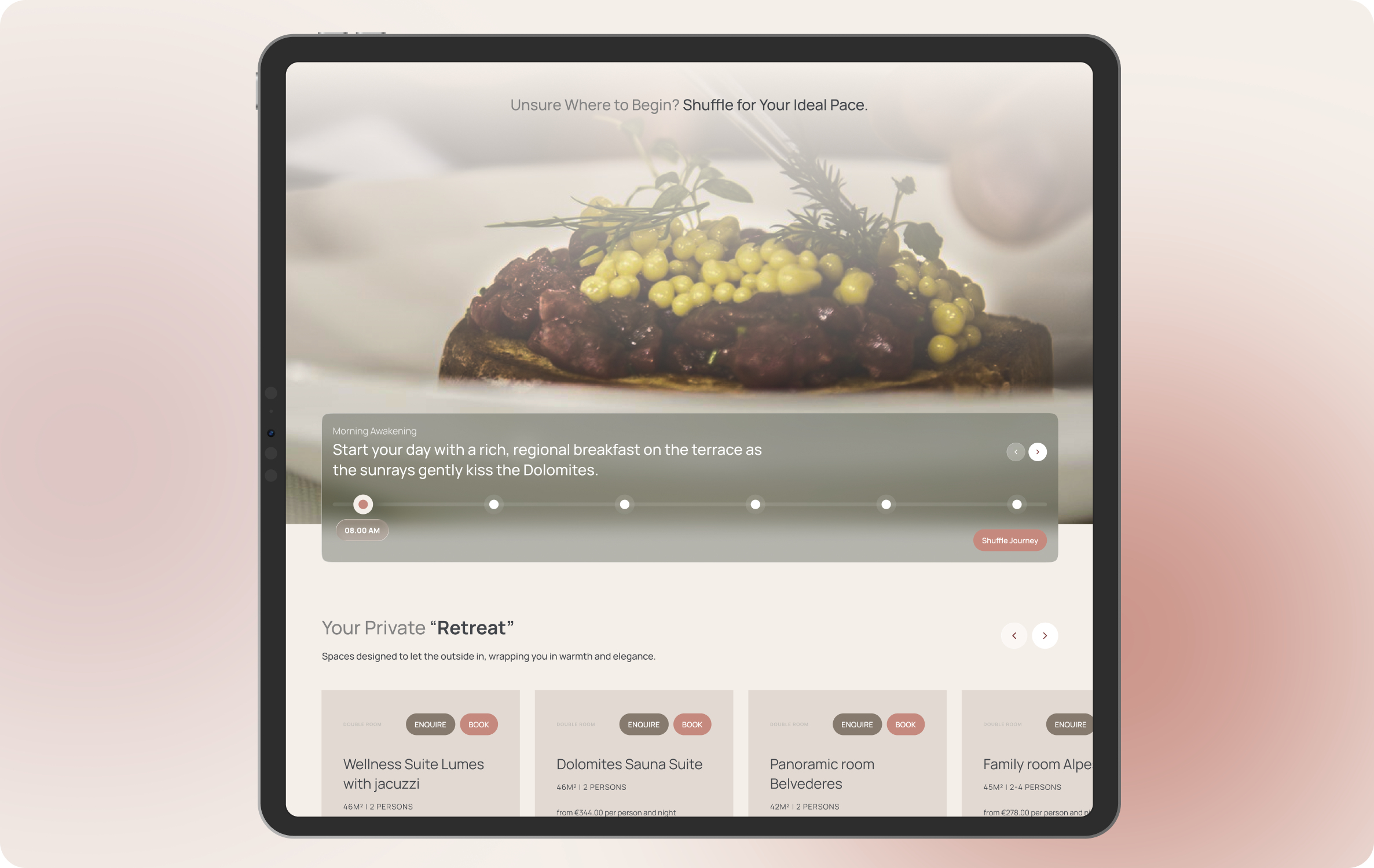
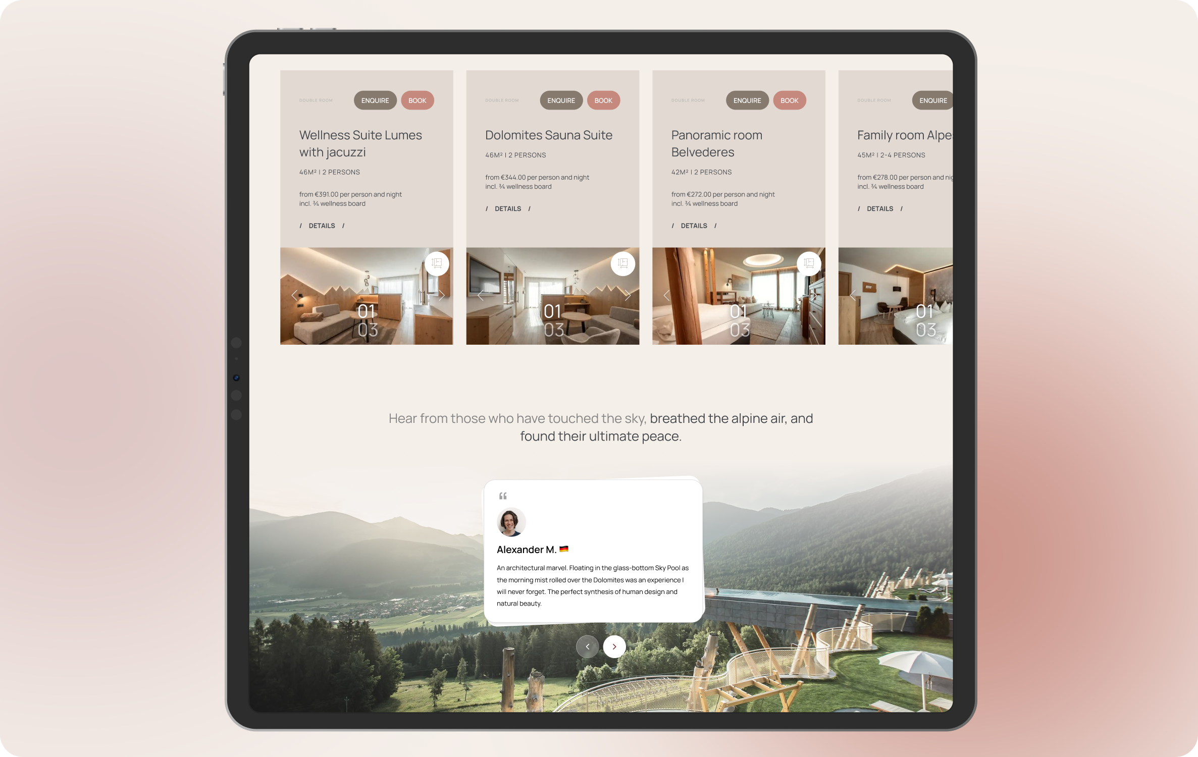
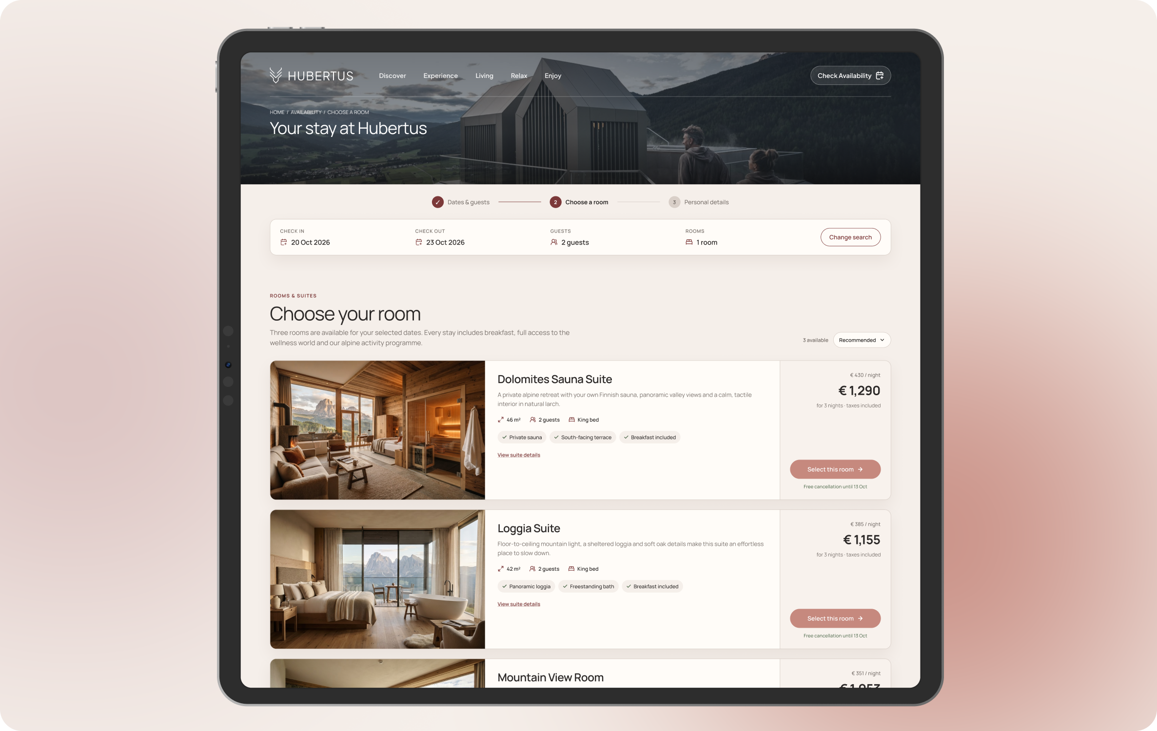
Now that they’re hooked on the experience, I hit them with the actual rooms. I kept these cards clear, just the important specs, transparent pricing, and obvious buttons to 'Enquire' or 'Book'. It’s straightforward so there’s no friction or confusion when they’re finally ready to pull the trigger.
When you're charging premium prices, people need to know it's worth it. I kept this section minimal and clean. Real reviews from past guests help build trust and back up everything we promised in the sections above, giving them that extra sense of security.
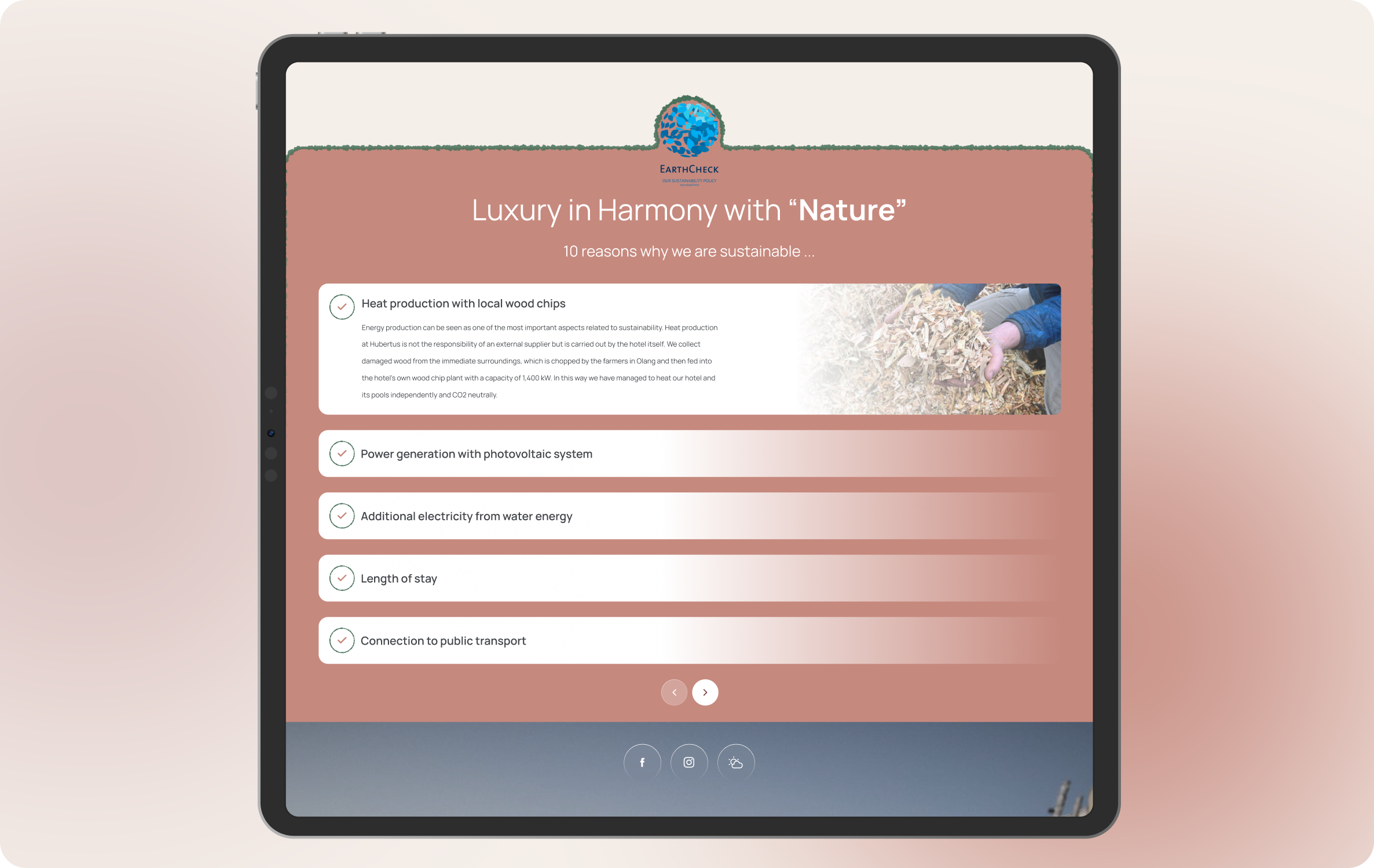
A lot of travelers care deeply about the environment now, so highlighting the hotel's eco-friendly side is a great move for social proof. To make it stand out, I added that grass-like border. It breaks up the standard boxy layout and is a fun, visual way to tie the design back to nature.
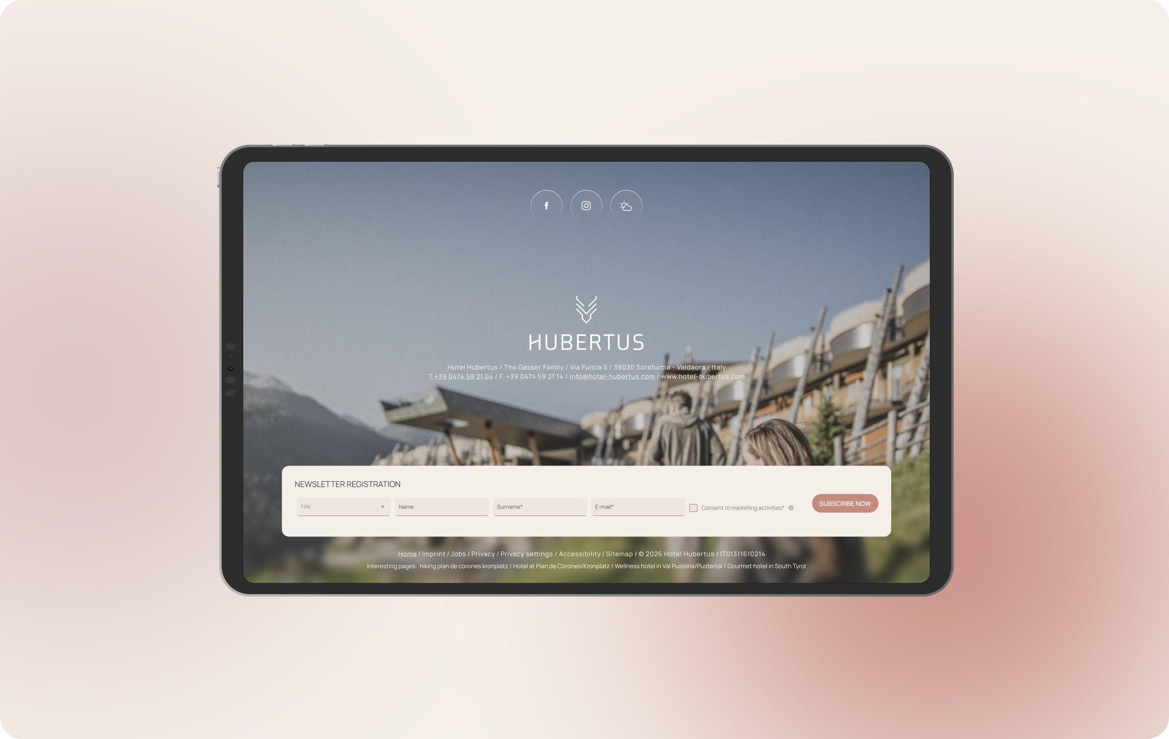
The dark footer grounds the page nicely, but its real job is capturing leads. If a user loved the site but isn't quite ready to drop money on a 5-star hotel today, the newsletter sign-up is our safety net. We get their email, I build that relationship, and we can invite them back later to become loyal guests.