Transforming an outdated UI into a modern, high-converting experience.
1. Overview
In the competitive restaurant SaaS industry, the digital ordering experience is key to driving sales. This project focuses on a complete redesign of the Menumiz online ordering feature. The main goal was to fix confusing navigation, update the outdated interface, and introduce a smart AI assistant to speed up checkout and keep customers coming back.
2. The Baseline: Analyzing the Old UI
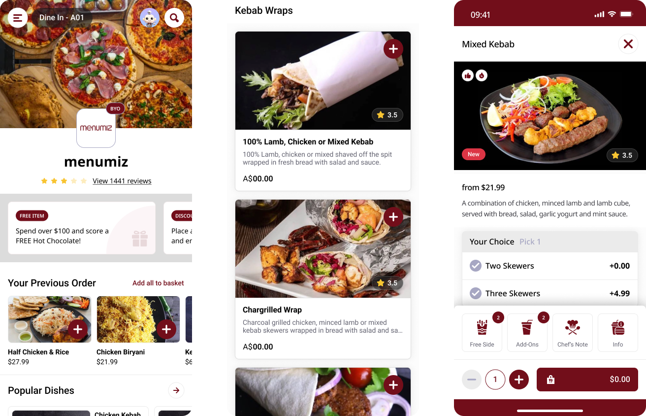
Before designing, I took a close look at the old interface. The legacy design felt very rigid and acted more like a static inventory list than an engaging food app. The valuable "above the fold" area at the top of the screen was not used well. It lacked a clear structure to highlight promotions or strong restaurant branding. Overall, the app felt purely transactional and was missing the warm, intuitive feel that users expect from modern digital products.
Menu List & Details (Old Version)
3. The Core Challenges (Pain Points)
A thorough UX audit revealed five main problems that frustrated users and slowed down the ordering process:
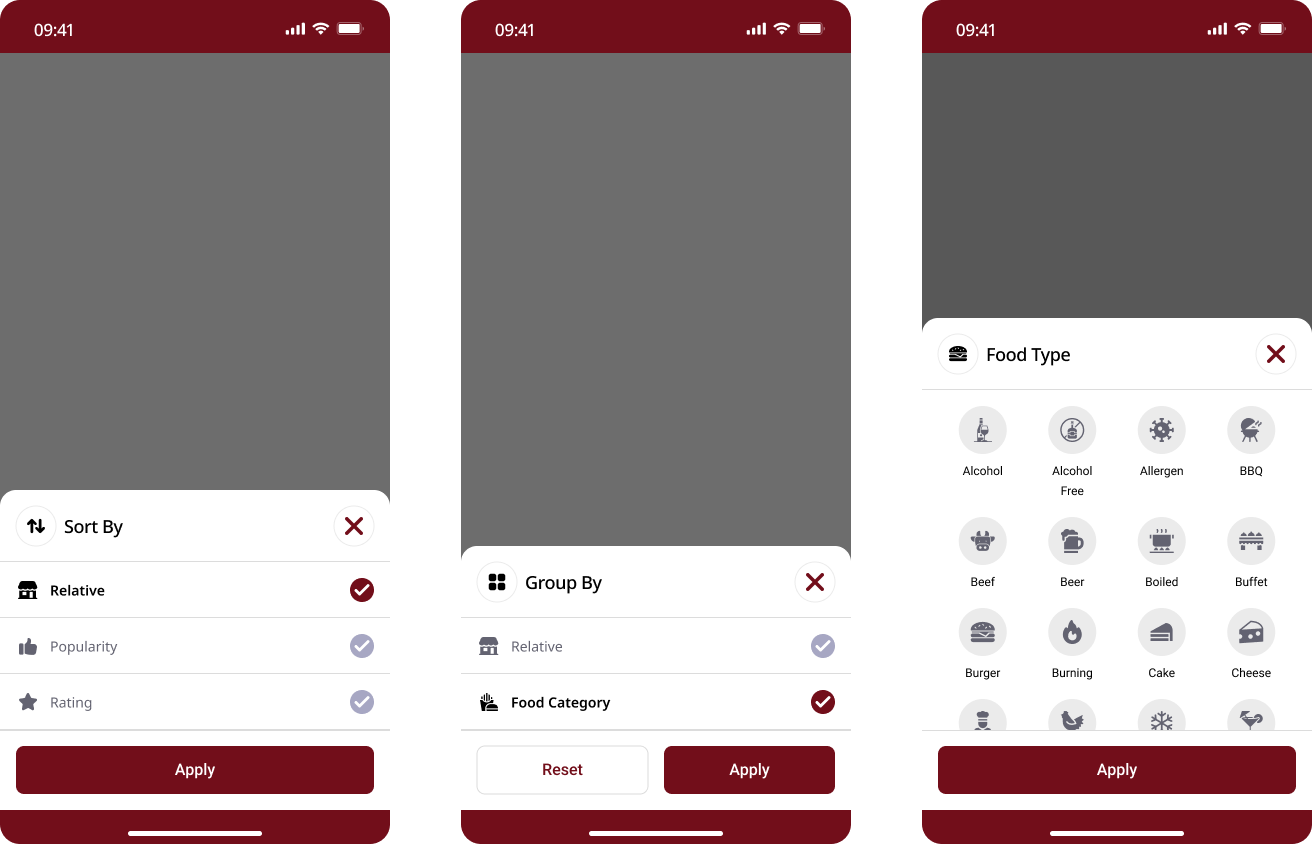
Confusing & Limited Filters: Sorting and filtering options were hidden inside clunky, rigid dropdowns. Users had to think too hard and take too many steps just to find specific food categories.
Filter (Old version)
Rigid & Outdated UI: The overall visual style, including the card layouts and spacing, felt old and stiff. It failed to make the food look appetizing or premium.
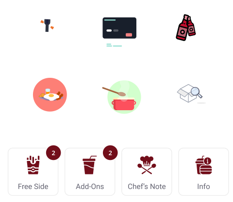
Flat & Boring Icons: The old design used standard flat icons that lacked personality. They failed to build a modern and unique visual identity for the platform.
Flat Icon (Old Version)
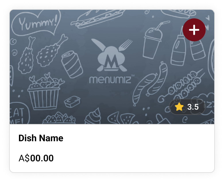
Lack of Innovation & Poor Edge Cases: The app felt basic and lacked smart features to help the user. Furthermore, it handled "edge cases" poorly. For example, if a menu item didn't have a photo, the space was just left empty, making the screen look broken or unfinished.
Image not available case
Buried "Order Again" Feature: Important features for returning customers, like previous orders, were hidden under generic scrolling banners. Because users naturally ignore these banners (banner blindness), it slowed down loyal customers who just wanted to quickly reorder their favorites.
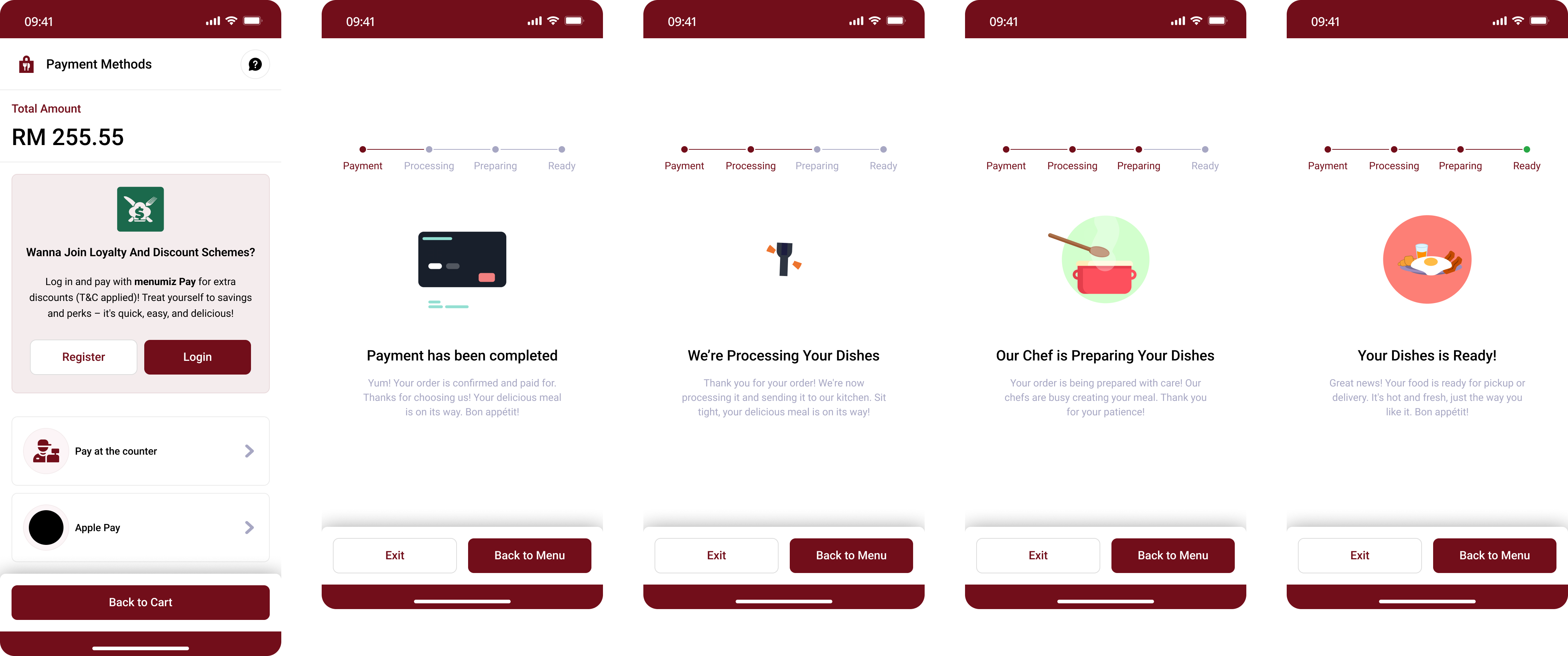
Clunky Checkout & UX Writing Issues: The checkout page had a rigid layout and used confusing text (UX writing issues) that made the payment step feel complicated. Just like the rest of the app, the checkout process relied on flat, unengaging icons that failed to provide a smooth and reassuring experience when users were ready to pay.
Check out process (Old Version)
4. The Solution: A Clean & Flexible Interface
To solve these problems, I completely rebuilt the interface, focusing on visual hierarchy, aesthetics, and Conversion Rate Optimization (CRO).
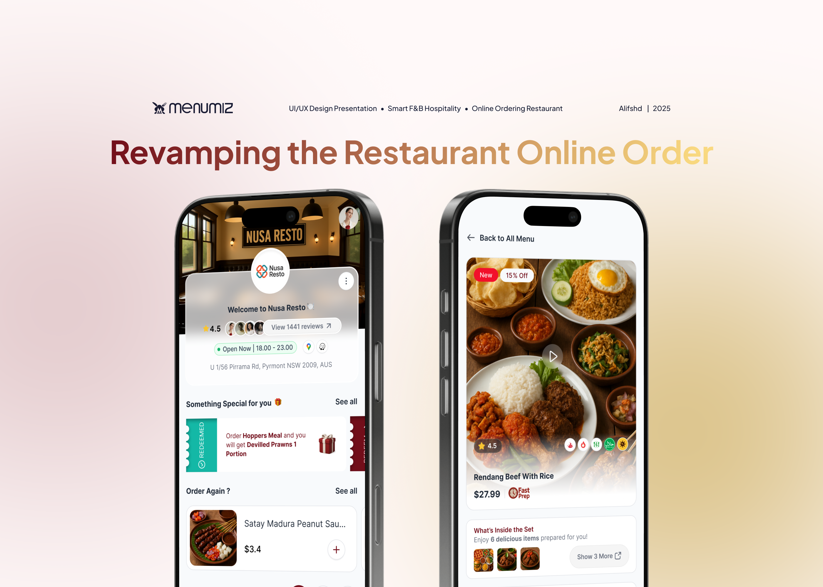
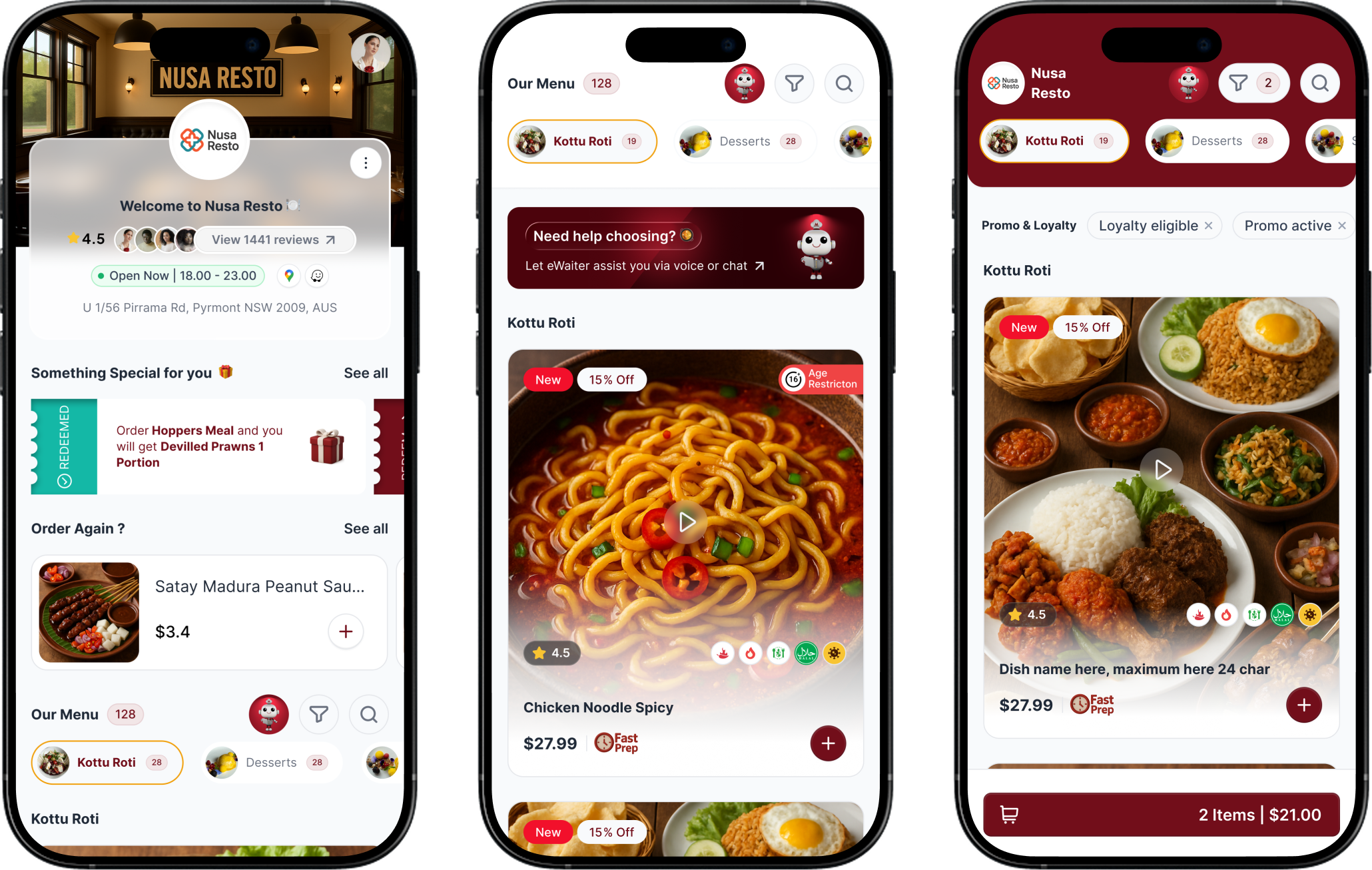
Clean Modular Layout: I organized the layout using neat, floating cards to clearly separate information. Now, "Something Special" promos and the "Order Again" prompts sit right at the top, allowing returning users to check out instantly.
Restaurant Page & Menu List (New Version)
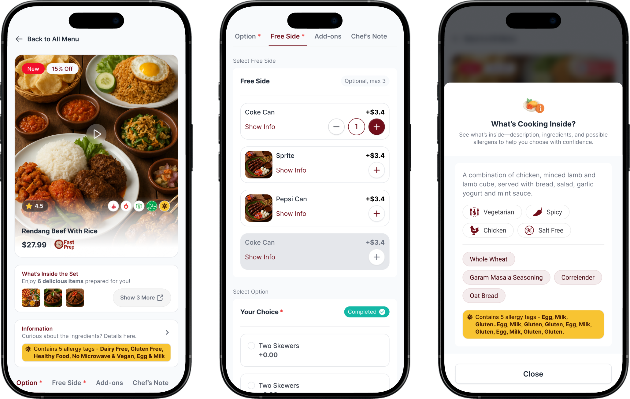
Details Menu & Option Menu (New Version)
Strong Typography: To create a premium and clean look, I used the Plus Jakarta Sans font family. By strictly applying Medium weight for titles and Light weight for descriptions, the text is incredibly easy to scan without making the screen look cluttered.
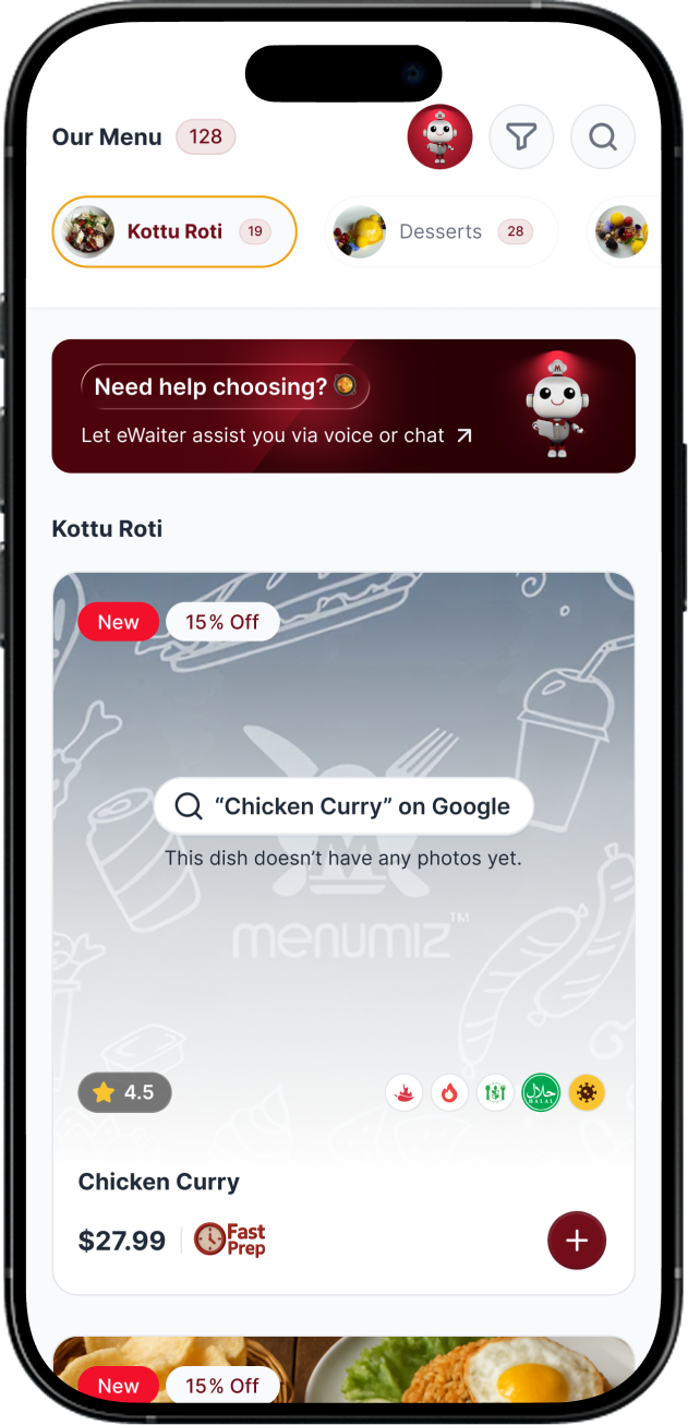
Visual Filter Chips: I replaced the clunky dropdown menus with dynamic visual category chips. These chips include small image previews and item counts, giving users instant context so they can navigate the menu effortlessly.
Creative Empty States: When a food photo is missing, the interface no longer looks broken. Instead, it displays a subtle branded watermark paired with a "Search on Google" button. This keeps the design looking intentional, professional, interactive, and can get an idea of the menu that the customer will order.
No Image Case
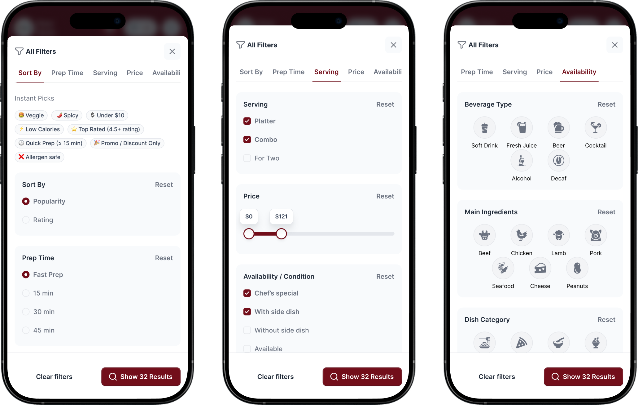
Data-Driven Dynamic Filtering & "Instant Picks": I collaborated closely with the CTO and backend team to rebuild a dynamic filtering system based on what is technically feasible and most likely to drive orders. Because these filters adapt to each restaurant's specific menu data, I also introduced an "Instant Picks" section to speed up the user experience. This feature uses historical customer data to turn the most popular filter combinations into simple, one-click buttons (like "Quick Prep" or "Under $10"), removing the hassle of selecting multiple filters manually.
Dynamic Filter (New Version)
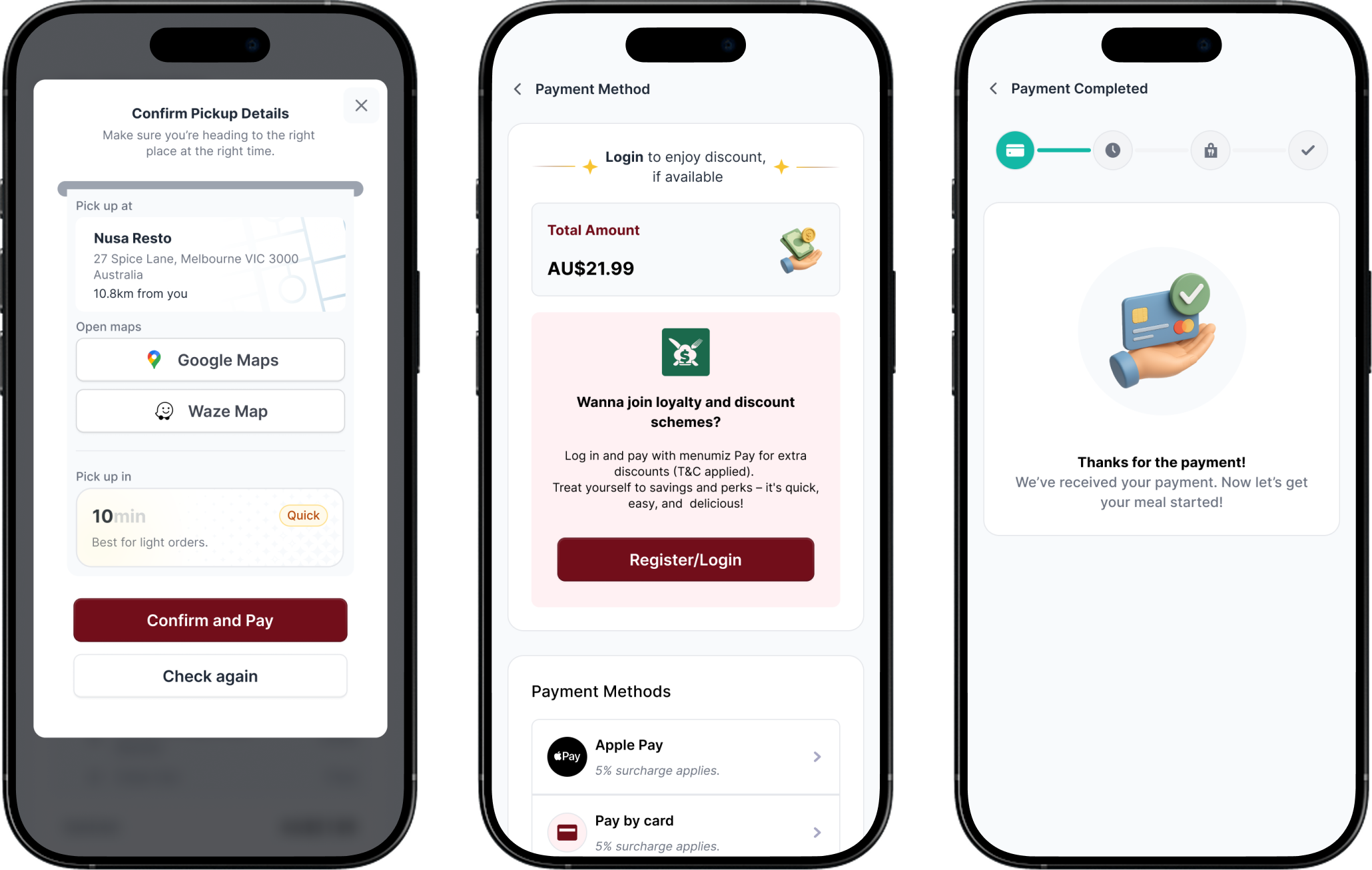
Engaging Checkout UI: By integrating a cleaner layout and the new 3D icons into the cart and checkout flow, the process feels less like filling out a boring form and more like a modern, engaging experience.
Confirm Check Out & Payment Process (New Version)
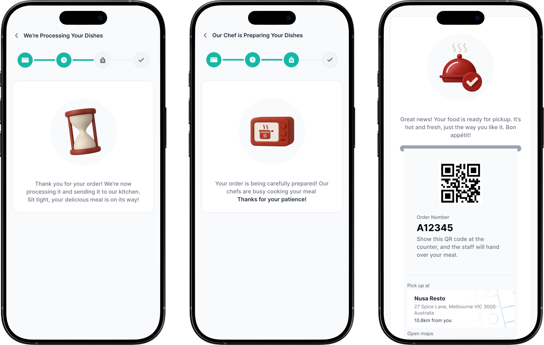
Order Confirm & Order Ready (New Version)
5. Visual Identity & 3D Iconography
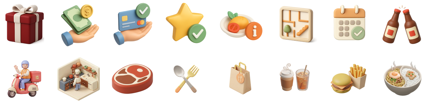
To completely eliminate the "outdated" feel, I build and replaced all the flat icons with a custom set of highly detailed 3D illustrations.
Appetite-Inducing Colors: The 3D assets use a warm color palette of terracotta reds, warm oranges, and soft creams. Psychologically, these colors are proven to stimulate appetite, create positive energy, and build a sense of urgency to buy.
3D Icon Set for New Design
6. Innovation: Smart eWaiter AI Assistant
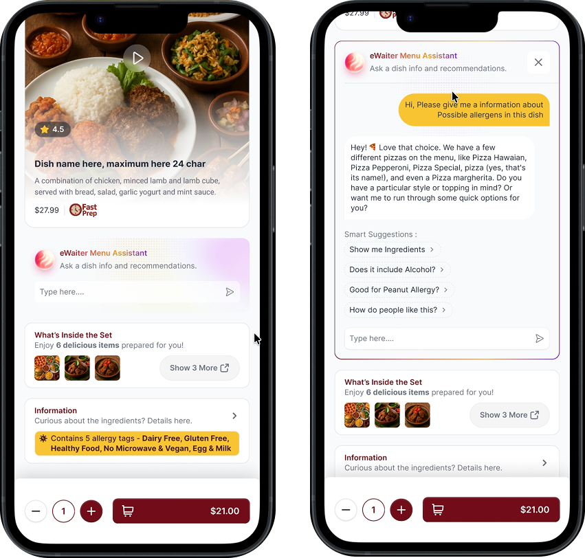
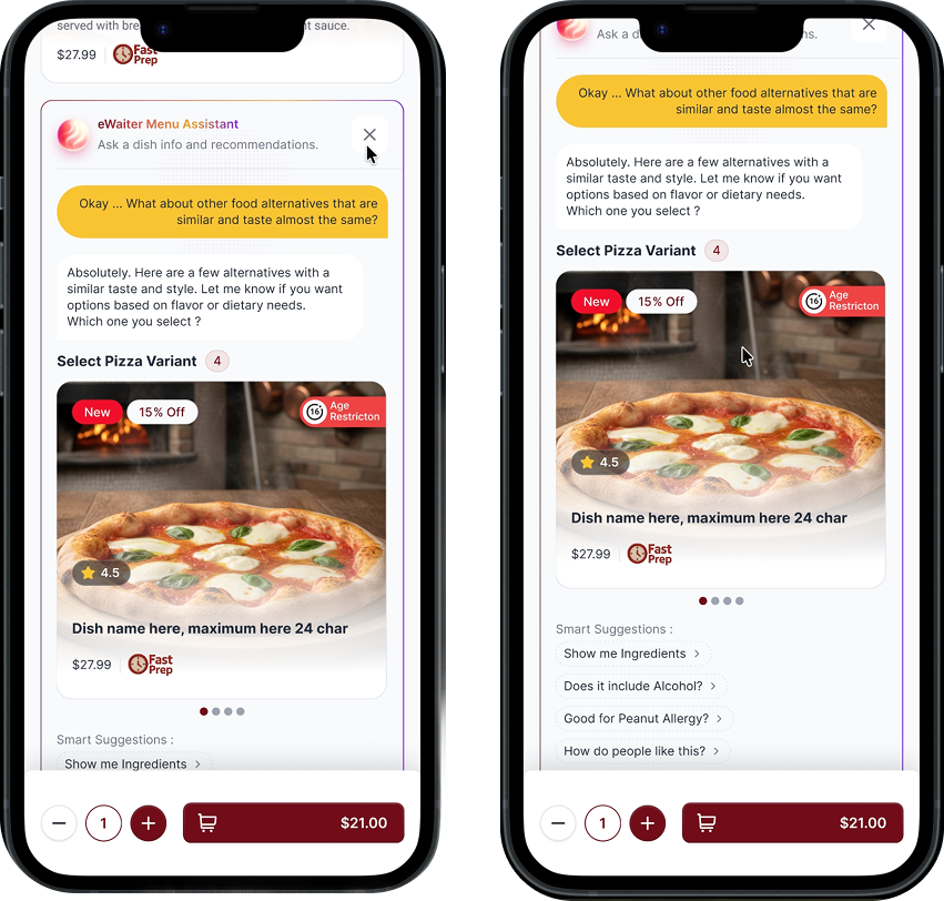
The most exciting addition to this redesign is turning the existing eWaiter AI into a true menu assistant. I put it directly on the menu details page, exactly where people are deciding what to order. The goal was simple: give users a digital waiter they can ask anything. Whether they want to know about hidden allergens, spice levels, or general restaurant info, they can get answers right before hitting "Add to Cart." This instantly clears up any doubts and makes them feel confident about their order.
Smooth In-Line Chat: Instead of using annoying pop-ups or taking users to a new screen, the chat expands right under the food photo. This keeps them focused on the dish and doesn't break the user experience.
Multilingual Support: This is a huge plus for international tourists. They can ask questions like "Does this have peanuts?" in their native language and get instant answers without the restaurant needing to provide manual translations.
Keeping API Costs Down: To make sure this feature doesn't drain the company's budget, the AI chats have a session time limit and don't save history permanently. I also added "Smart Suggestion" chips. These let users ask common questions with one tap, saving them time and reducing the processing load on the system.
The Menumiz Online Ordering redesign successfully bridged the gap between a rigid, outdated digital menu and the fast-paced, intuitive expectations of modern diners. By focusing on conversion rate optimization (CRO) and seamless navigation, the updated design delivers measurable improvements across both user engagement and revenue generation:
30% Faster Time-to-Cart: Replacing clunky dropdown menus with dynamic visual filters and the data-driven "Instant Picks" section eliminated multiple steps in the browsing process. Customers can now find and select their desired meals smoothly, drastically reducing cognitive load.
25% Decrease in Cart Abandonment: The integration of the in-line eWaiter Menu Assistant effectively acted as a digital server. By answering allergy and ingredient questions instantly, combined with a highly transparent checkout UI, the platform completely removed last-minute purchasing hesitation.
45% Boost in Reorder Rates: Elevating the "Order Again" cards to the very top of the modular layout rescued this crucial feature from banner blindness. Returning customers can now bypass the main menu and checkout in just a few taps, directly increasing customer loyalty.
Optimized Operational Costs: The implementation of "Smart Suggestion" chips and strict session limits on the AI assistant proved that the platform can offer premium, multilingual tech innovations without bloating the company’s API processing budget.
"Validated through direct operational observation and customer feedback across 5 pilot restaurant partners over a 30-day period."